No comments
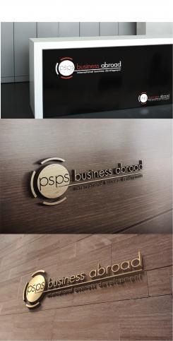
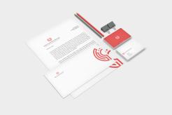
Re branding thus adaptation of current logo
- Contest holder: Peter Sanders
- Category: Logo design
- Status: Ended
- Files: File 1
Start date: 07-03-2019
Ending date: 09-04-2019
It all started with an idea...
A short, interactive guide helped them discover their design style and clearly captured what they needed.
Brandsupply is a platform where creative professionals and businesses collaborate on unique projects and designs.
Clients looking for a new logo or brand identity describe what they need. Designers can then participate in the project via Brandsupply by submitting one or more designs. In the end, the client chooses the design they like best.
Costs vary depending on the type of project — from €169 for a business or project name to €539 for a complete website. The client decides how much they want to pay for the entire project.
No comments
I think it looks f.king awesome!
No comments
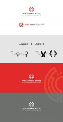
Clear explanation of the logo. However, we are unsure whether the logo would hold the same value without the explanation. A lot of people would not recognise the two separate elements and instead see it as one.
Hi, thx for your feedback.
U're right, but what is interesting is also the second reading, the discovery, calling to mind.
Many logos are based on this second reading, for example Carrefour (https://www.creads.fr/app/uploads/sites/1/2016/11/ficwfeawoeovkgdswhvozvjuob8@750x294.jpg), or TGV (http: / /cdn.secouchermoinsbete.fr/medias/images/logo-tgv.jpg).
The logo may also have a less direct shape at first reading but with a background and an smart shape at second reading.
It's what i think :)
Mmmm Peter, I think you will find that will 'fill in' (in print) and is blurred (see preview) on screen, at smaller sizes. One of the stipulations in your briefing).
Mmmmm thanks for tout coment Ident Corps Branding but i do this job for 20 years ago so i know what i do.
Please talk about your projects and not about the other one
Mmmmm thanks for tout coment Ident Corps Branding but i do this job for 20 years ago so i know what i do.
Please talk about your projects and not about the other one
@ident Corp Branding: why are you reacting on others page? This is not how it should be. Your trying to influence the owner of the contest. Not very chique.
@Demetriax, good work.
@Creator, thx for your comment, u know i guess "Ident Corp Branding" is a bit young so we have to apologize him ;)
 Nederland
 België
 France
 Deutschland
 Österreich
 United Kingdom
