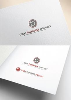
Re branding thus adaptation of current logo

Contest details:
Silver

  • Contest holder: Peter Sanders
  • Category: Logo design
  • Total budget: € 369.00
  • Start date : 07-03-2019 17:26
  • Ending date : 09-04-2019 15:20
  • Status : Ended
  • Relevant files: None
  • Available languages:
  • Number of designs: 169
  • Response rate:
    low high

Needs:

Who are we?
psps develops international sales- and distribution networks, for Dutch and foreign SME’s. Our geographical focus is on the UK, Benelux, DACH region and US. Our customer base comprises of private companies as well as public trade- and investment promotion organizations. Our investment services: numerous business development trips since we started in 1999, created an extensive CRM database, helping us to identify Dutch investors (FDI), in commission of foreign regions and countries.

Our 'why"
Success on international markets is all about building meaningful, long lasting human relationships. Understanding how cultures and markets differ, helps us to gain people’s trust. In doing so, short term business results convert into long term success on international markets. This is our clear commitment, to Dutch and international customers, public as well as corporate.

Our pay-off
BUSINESS ABROAD: GET CONNECTED, GAIN TRUST, GENERATE REVENUE

Name change
From:
psps consultants
export & investment services

To:
psps business abroad
international business development

We have used psps for 20 years, the addition 'consultants' is not always regarded positive in some countries. We want more immediate understanding of what it is we do.

Our demands/expectations
The current colours are e02d29 rood, 6c6d6c grijs. We would like to stick to those colours.
We like the combination of word and image logo components. We like the idea of being able to use these components separately.
The image logo (the square or whatever it will turn into) should be recognizable from a distance. We should be able to use it even in small versions (i.e. business cards).
We would like to stick to lower case lettertype
We do not prefer the use of gradients
Would be preferable if the logo can be used on a white as well as a black background
Pls. do not use stock vectors
Pls. be aware that small adjustments are also welcome. In the current image logo (the square) there is a "C" in the middle, which referred to consultants; this is not relevant anymore in the new name.

Company description:

Target group:

Colors, favourites and other requirements

masterbrandy
  • Logo design # 952529 for Re branding thus adaptation of current logo contest Submit complaint
    1. Description by designer masterbrandy:

      with this your request.

    2. masterbrandy says

      color can be change.. a circle means abroad, world wide etc.

    3. Peter Sanders says :

      Thank you. i understand the shape. That said, the visual emphasizes the non descript part of our name.

    4. This contest is finished. Its not possible to reply anymore.

  • Logo design # 952526 for Re branding thus adaptation of current logo contest Submit complaint
    1. No comments

    2. This contest is finished. Its not possible to reply anymore.

  • Logo design # 952525 for Re branding thus adaptation of current logo contest Submit complaint
    1. masterbrandy says

      The logo contain letter P and S. feedback is welcome.

    2. Peter Sanders says :

      Thank you. Good design. The "psps" part of our name does not express what we do. The visual suggests something to do with packaging, transport, boxes, etc.

    3. masterbrandy says

      i Peter, Thank you for appreciating my design,

    4. masterbrandy says

      if ever you like we can design a logo that contains symbol of boxes, logistics, and trucks or a car wrap.

    5. This contest is finished. Its not possible to reply anymore.

  • Logo design # 946420 for Re branding thus adaptation of current logo contest Submit complaint
    1. masterbrandy says

      I just made it unique related in worldwide and international for business abroad.

    2. Peter Sanders says :

      Beste Ben,
      Dank voor je inzendingen. Het laatste voorstel ziet er strak uit. Zou het graag willen zien met de letters in lowercase, zoals aangegeven in de briefing.

      Met vriendelijke groet,

      Peter

    3. This contest is finished. Its not possible to reply anymore.

  • Logo design # 946418 for Re branding thus adaptation of current logo contest Submit complaint
    1. masterbrandy says

      with the connectivity abroad.

    2. This contest is finished. Its not possible to reply anymore.

  • Logo design # 946402 for Re branding thus adaptation of current logo contest Submit complaint
    1. Description by designer masterbrandy:

      Hoi,

      met dit mijn ontwerp, feedback is welkom, ik zal uw wensen uitwerken.

      Met vriendelijke groet, Ben

    2. This contest is finished. Its not possible to reply anymore.

Social Network