No comments
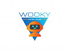
Redesign a modern and fun logo for a lead generation start-up
- Contest holder: Rijntjevanwijk
- Category: Logo design
- Status: Ended
- Files: File 1, File 2, File 3
Start date: 09-07-2018
Ending date: 11-07-2018
It all started with an idea...
A short, interactive guide helped them discover their design style and clearly captured what they needed.
Brandsupply is a platform where creative professionals and businesses collaborate on unique projects and designs.
Clients looking for a new logo or brand identity describe what they need. Designers can then participate in the project via Brandsupply by submitting one or more designs. In the end, the client chooses the design they like best.
Costs vary depending on the type of project — from €169 for a business or project name to €539 for a complete website. The client decides how much they want to pay for the entire project.
No comments
Hey Logomon,
Showed your logo among others internally to our owners and they really like the left one - however - one of them feels maybe its too playful in a childish way. Would you be able to play around with the colors to make it a bit more serious? And also show us a design that has no triangle - no stars - Just WOOKY and the robot - preferably a 'landscape' (wide) design? Alternatively with WE SELL SALES underneath WOOKY if it fits well (feel free to be creative).
No comments
Thanks for your feedback and rating.
Please check the logo with a different robot.
Feel free to give me your feedback.
L
Really like your redesign! Could you make a version of this but then with the triangle upside down and WOOKY and WE SELL SALES at the bottom below it? Like the original. Preferably so it looks like the Robot is inside the triangle popping out.
No comments
Would you be able to define the robot a bit more? Flesh it out as a character more? See links in discussion for examples
Would you be able to define the robot a bit more? Flesh it out as a character more? See links in discussion for examples
 Nederland
 België
 France
 Deutschland
 Österreich
 United Kingdom
