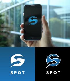
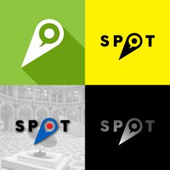
You need directions in order to get to the right spot, correct? That was my idea with this logo. Chat bubble with arrows create letter S. Smart and easy to remember. Works as an icon when scaled down. If you like this I will tune it a little bit more to get better proportions.
Startup that makes your life more convenient on the "Spot"
- Contest holder: joeb.w
- Category: Logo design
- Status: Ended
- Files: File 1, File 2, File 3
Start date: 21-03-2016
Ending date: 28-03-2016
It all started with an idea...
A short, interactive guide helped them discover their design style and clearly captured what they needed.
Brandsupply is a platform where creative professionals and businesses collaborate on unique projects and designs.
Clients looking for a new logo or brand identity describe what they need. Designers can then participate in the project via Brandsupply by submitting one or more designs. In the end, the client chooses the design they like best.
Costs vary depending on the type of project — from €169 for a business or project name to €539 for a complete website. The client decides how much they want to pay for the entire project.
Maybe you will not like this proposal but it was fun for me while I was drawing it. I wanted to incorporate few things in one logo, to make it clever.
So this is little bit different design. Search eye inside the chat bubble. Simple, easy to remember and suitable for app icon.
The eye feels creepy...
I know. Sorry :)
This is a further evolution of my design. I find it more simple and minimalistic. Icon incorporated in the logo. Combination of spotlight and chat bubble in one. You can also use the icon as a pin in case you want to mark the place on the map. Can work with colors, so you can get the British roundel as an example.
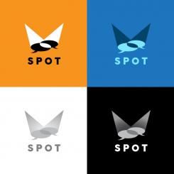
I got two chat bubbles incorporated into the spotlights that are overlapping each other.
My first association is the search result got through the chat between user and service. It can work with gradients on the darker or brighter background as well as two color option.
What do you think?
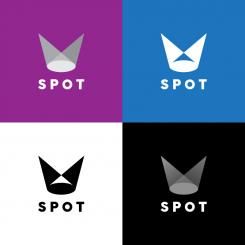
Variation of the previous design.
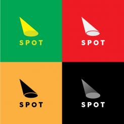
Single spot light. Asymmetrical and dynamic.Works without text also.
So my first association was a spotlight. Result of the search. Two directional light pointing at one spot.Can work as a gradient, colored or black/white option.
Without text its an icon for the app.
Hope you like it.
The "spotlight" idea is clever... could it possibly be done with overlapping stylized chat bubbles instead?
Of course, I'll see what I can do.
 Nederland
 België
 France
 Deutschland
 Österreich
 United Kingdom
