No comments
Startup that makes your life more convenient on the "Spot"
- Contest holder: joeb.w
- Category: Logo design
- Status: Ended
- Files: File 1, File 2, File 3
Start date: 21-03-2016
Ending date: 28-03-2016
It all started with an idea...
A short, interactive guide helped them discover their design style and clearly captured what they needed.
Brandsupply is a platform where creative professionals and businesses collaborate on unique projects and designs.
Clients looking for a new logo or brand identity describe what they need. Designers can then participate in the project via Brandsupply by submitting one or more designs. In the end, the client chooses the design they like best.
Costs vary depending on the type of project — from €169 for a business or project name to €539 for a complete website. The client decides how much they want to pay for the entire project.
What if the right chat bubble was higher than the left, to make more of an "S" shape?
Dear Joeb,
Thanks for you comment, i can change you suggestion. but problem is i upload all 15 files on your contest and that is max number on this site. if you can sent me your email, I'll sent you desing with your suggestion. You can contact me on this mail: mymyfamous@gmail.com
Greetings,
Factor
No comments
Dear Joeb,
Thanks for all feedback, and i think we together improved first desing. Hope you look for something like this is modern, friendly, simple, bold, and mimics the flip behavior of the app. change color of cube in logo preset connection, all logo is chat bubble, could. If you have any suggestion fell free to write. greeting factor
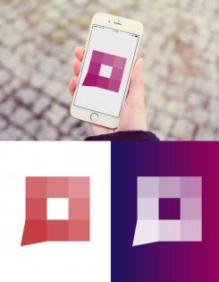
Too literally much like Flipboard :)
No comments
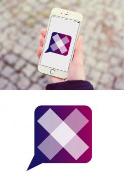
It's an app for Connection and conversation. An X won´t work...
No comments
Do you have somthing like this on mind? do you wont i can upload desing of before in cloud?
No comments
A symbol with meaning would be better appreciated...
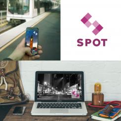
Thanks for comment, i work on desing to present you work, some my meaning of this logo would be < > and this have to present connection and conversation between your company and customers ,< > direction where we want to go, and all logo look like S- spot, if i change position of desing logo not look any of this. If you have some suggestion to help me to develop you desing fell free to tell.
factor
No comments
Thanks for feedback,do you have somthing like this on mind?
Greeting factor
No comments
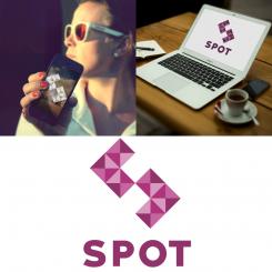
Let's keep it on a white background, only. Forget the color variations. And try using cell phone and laptop mockups to help present your work. Thank you.
Dear Joeb, thanks for your comment I am working on presentation logo using the mockups for cell phone and laptop. Can you leave me your e-mail to send you more mockups because on Brandsupply I can set 15 works. Greeting factor
No comments
Dear Joeb,
Hope you like desing, i work to be simple, this logo present <> (Connection,conversation between consumer and venue...) <direction, wherever you go>. and all logo is letter S spot. If you have any suggestion fell free to write.
Greeting factor
 Nederland
 België
 France
 Deutschland
 Österreich
 United Kingdom
