No comments
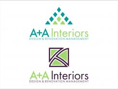
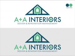
Stylish logo for a new company focussed on design and supervision of home renovations.
- Contest holder: A+A
- Category: Logo design
- Status: Ended
- Files: File 1, File 2
Start date: 22-03-2017
Ending date: 07-04-2017
It all started with an idea...
A short, interactive guide helped them discover their design style and clearly captured what they needed.
Brandsupply is a platform where creative professionals and businesses collaborate on unique projects and designs.
Clients looking for a new logo or brand identity describe what they need. Designers can then participate in the project via Brandsupply by submitting one or more designs. In the end, the client chooses the design they like best.
Costs vary depending on the type of project — from €169 for a business or project name to €539 for a complete website. The client decides how much they want to pay for the entire project.
Other designs, other styles... Let me know please. Thanks
Hi Nat., thanks 4 your explicite feedback. Please let me know if you would like any changes or modifications. I will send u other designs soon. Thanks.
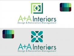
Thanks Andiacos, I think this is closer to the right way. And the other colour palette warmer? Thanks
Thanks Andiacos, I think this is closer to the right way. And the other colour palette warmer? Thanks
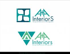
Hi, this one based on initials seems more minimalist i think...
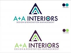
Dear Andiacos, thanks for your designs. I like the fonts, but I would like to hve the A+A different (bigger) than the Interiors (with lower case except for the I). For the logo I would like to have something simpler, not figurative. Can you try maybe another one with this feed back? Also it would be nice if you can combined the 2 palettes of colours (green-blue with opposites), Thanks a lot. Regards, Natalia
 Nederland
 België
 France
 Deutschland
 Österreich
 United Kingdom
