No comments
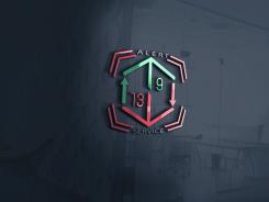
’Trading Alerts’ logo for professional Wall street brokers
- Contest holder: daisykomen
- Category: Logo design
- Status: Ended
- Files: File 1, File 2, File 3
Start date: 26-01-2020
Ending date: 02-02-2020
It all started with an idea...
A short, interactive guide helped them discover their design style and clearly captured what they needed.
Brandsupply is a platform where creative professionals and businesses collaborate on unique projects and designs.
Clients looking for a new logo or brand identity describe what they need. Designers can then participate in the project via Brandsupply by submitting one or more designs. In the end, the client chooses the design they like best.
Costs vary depending on the type of project — from €169 for a business or project name to €539 for a complete website. The client decides how much they want to pay for the entire project.
No comments
hi! according to your drawing n = 01 the candles are like that right?
Maybe it look better if the left trading candle is the same as the right trading candle. But then in green yes, and the one on the right keep like this. Also can I see the design with only saying 'Alerts' (loosing the 'Service' part of the name)
ok!
No comments
Hi! thanks for this update. I actully meant the left and the right little arrows to be replaced by a trading candle that looks 'neutral'. like the third candle from the right in my 'file 1' drawing. This because above the 9 and below the 13 there are already two nice big arrows. Maybe you can update this? I like the 9 and 13 being bigger. thanks
Hi! thanks for this update. I actully meant the left and the right little arrows to be replaced by a trading candle that looks 'neutral'. like the third candle from the right in my 'file 1' drawing. This because above the 9 and below the 13 there are already two nice big arrows. Maybe you can update this? I like the 9 and 13 being bigger. thanks
No comments
Hi! I hope I have collected all of your recommendations.
Hi! I hope I have collected all of your recommendations.
yes, the numbers like this are better.
No comments
Hi! Click on picture to enlarge.
looks nice on the page that logo. would like to see it with those candles from last message.
looks nice on the page that logo. would like to see it with those candles from last message.
ok
another recommendation?
Looks nice! is it possible to make the left and right geen/red arrows a tradingcandle? See what that looks like? Look at my image '1' and then the third 'candle' from the right. that is a red trading candle with a line above and a line below the candle. you could make the right one red and the left one green. let's see what it looks like
when you made the new design with the candles could you send that. and also send a version where you do use the previous 8 alarm lines that were around the hexicon, but put them around the text 'alert service' in 4 corners around the text. so the text would be 'alerting'. maybe too much, but let's see.
with 'image 1' I mean file 1 from my input files.
Can I also see a version where the 9 and the 13 are bigger? like how they were in the first design in sizing. So this would be another version.
-geeen/red arrows a tradingcandle version
-8 alarm lines that were around the hexicon, but put them around the text 'alert service' in 4 corners around the text version
-9 and 13 number bigger version.
Also as an input for all new designs going forward. the 9 should be left and the 13 should be right . because it's called 9/13. so the 9 comes first.
but then the 9 should be green and the 13 red. so make the 9 move up to the left upper hand corner and the red 13 to the right hand corner.
No comments
looks nice as a first design. could you remove the 'alarm lines' (the 8 lines aroud the hexicon? and the 9 should be in the left upper side and the 13 in the right hand corner. and could you make one like I just said. and could you also make one with the text alert service placed on the right side? I'll see your proposal where that is in combination with the hexicon. thanks! daisy
 Nederland
 België
 France
 Deutschland
 Österreich
 United Kingdom
