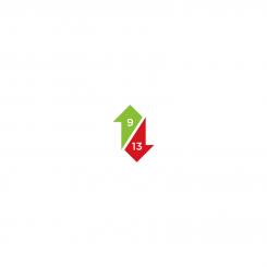
’Trading Alerts’ logo for professional Wall street brokers
Contest details:
Bronze
- Contest holder: daisykomen
- Category: Logo design
- Total budget: € 229.00
- Start date : 26-01-2020 23:45
- Ending date : 02-02-2020 00:00
- Status : Ended
- Relevant files:
- Available languages:
- Number of designs: 99
-
Response rate:
low high
Needs:
We will alert traders when it's time to enter or exit a trade.
When our indicator hits a 9 or 13, an alert is send to the subscriber.
explanation:
We are launching a service which sends subscribers trading alerts. The alerts will be sent to their phone through Telegram or Whatsapp. We would like to use the logo for all our communication. (website, Telegram logo, business cards, stationary, give aways. etc)
How the 9-13 Alert Service works:
Client subscribes to our website, chooses which alerts he wants to receive (commodities, stocks, currencies, crypto).
The system will give a signal at the time a potential market change has arrived.
This signal will be sent to their Telegram/Whatsapp.
We would be looking for a logo with or without the text 'Alert Service' in it.
So it can be a more graphic logo, or you can play with the name of the service. It should appeal to traders. (>85% male). So it needs to be a strong logo and not too feminine.
It needs to give people the feeling that if they buy this service they can time the market before it changes.
Some more input:
As an input for the logo,if you want to design something with trading candles in it, make it look like someone could buy the bottom at a 9, plus a 13 and at then the chart goes up, and there will be a sell signal at the top with a 9. (I would propose not using more than one 13 in a design like that. 9's occur more often than 13's).
An example of a chart which has a 9 as a reversal point for a trend is in the attachments.
Upward candles are always green, downward ones are red.
A 9 at the top is green and has a red arrow pointing down.
A 9 at a bottom candle is red and has a green arrow arrow pointing up.
Same for a 13 at the top or bottom.
I drew a 'perfect' example of a candle set up that works. If you want to make a logo with candles and 9 / 13 numbers, then use that as input.
Also, good to know: the 9 is always above a candle, the 13 is below a candle.
Also, visit www.tradingview.com for more inspiration on traders candle graphics. And also, you can go to www.tradingview.com/chart, and you can screenshot a chart there and use it for your graphic.
I also included a mock up that a friend made, some quick drawings. Just for input, please..this is not a cope paste, be creative:). I am giving a lot of input here, but I am also looking forward to seeing some creative minds at work with this. Thank you.
Some more input: see a chart line here, which could also be a nice add to the design. https://www.tradingview.com/x/1hxL9kKB/
Company description:
Target group:
>85% male/ professional traders
Colors, favourites and other requirements
Color logo, see full description for more details
gilang11
-
-
daisykomen says :
samen comments as the below one
-
daisykomen says :
Also, for both ones, so this one and the below one (I'm not sure yet which one I like best, (so please edit both options): Could I also see a design with only 'ALERTS' next to the logo? (losing the word service) This would mean that the wording would move down.
-
gilang11 says
I will revise it, but time is up.
I will give as you requested. -
This contest is finished. Its not possible to reply anymore.
-
-
-
Description by designer gilang11:
please give me feedback
-
daisykomen says :
Nice. Can you show me the 9 being in the left hand top side and the 13 being in the lower right hand side?
-
daisykomen says :
And after that also a version with the numbers being slightly bigger. so two new versions.
-
daisykomen says :
aslo the trednline in the middle. I actually like the thickness of the line more i nthe design 'on the wall'. So could you also make that line thicker in the logo designs. (so the other 3 ones line thicker). Maybe also make that a new option design, next to the other two things i just asked for. thanks
-
This contest is finished. Its not possible to reply anymore.
-
-
-
Description by designer gilang11:
how abouth this one
-
This contest is finished. Its not possible to reply anymore.
-
-
-
daisykomen says :
So maybe work with the number 9 and 13 bigger. and Service is not very readable when it's red.
-
This contest is finished. Its not possible to reply anymore.
-
-
-
daisykomen says :
the line looks too much like water. doesn't give me any feeling of trading in the logo.
-
This contest is finished. Its not possible to reply anymore.
-
-
-
daisykomen says :
this is not the one I think. it looks too much like trees in stead of something with trading
-
This contest is finished. Its not possible to reply anymore.
-
-
-
daisykomen says :
Could you make the 9 and 13 numbers more visible? Our whole system is build around alerts at numbers 9 and 13 in a chart. thanks
-
This contest is finished. Its not possible to reply anymore.
-
-
-
daisykomen says :
Here the red Service is hard to read. so I would do something with making the upward chart line on the left green when it goes up and red when it goes down. and then make the word Service not red.
-
This contest is finished. Its not possible to reply anymore.
-
-
-
daisykomen says :
This is nice, but I miss the color red. Also Service is spelled with a 'c' not an 's' ('Service' ). maybe update this one with the color and right spelling?
-
This contest is finished. Its not possible to reply anymore.
-
-
-
Description by designer gilang11:
please give me feedback
-
daisykomen says :
Hi! this is a bit too busy, and hard to make a small logo for social media from
-
This contest is finished. Its not possible to reply anymore.
-
-
-
Description by designer gilang11:
how about this one,sir?
-
daisykomen says :
Hi! this is a bit too busy, and hard to make a small logo for social media from
-
This contest is finished. Its not possible to reply anymore.
-
-
-
daisykomen says :
Hi! to me this looks a bit too 'blocky' could it be thinner arrows and maybe at something like a chart line? maybe this helps: https://www.tradingview.com/x/1hxL9kKB/
-
This contest is finished. Its not possible to reply anymore.
-
-
-
daisykomen says :
maybe at something like a chart line? maybe this helps: https://www.tradingview.com/x/1hxL9kKB/
-
This contest is finished. Its not possible to reply anymore.
-
-
-
daisykomen says :
maybe the rounding here could be a chart line, that might look nice. look here for exapmle maybe at something like a chart line? maybe this helps: https://www.tradingview.com/x/1hxL9kKB/
-
This contest is finished. Its not possible to reply anymore.
-
-
-
daisykomen says :
oh yeah, this one was a bit too simple, but I see I hadn't commented on this. the newer ones are better.
-
This contest is finished. Its not possible to reply anymore.
-