No comments
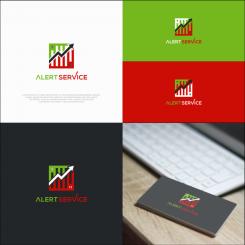
’Trading Alerts’ logo for professional Wall street brokers
- Contest holder: daisykomen
- Category: Logo design
- Status: Ended
- Files: File 1, File 2, File 3
Start date: 26-01-2020
Ending date: 02-02-2020
It all started with an idea...
A short, interactive guide helped them discover their design style and clearly captured what they needed.
Brandsupply is a platform where creative professionals and businesses collaborate on unique projects and designs.
Clients looking for a new logo or brand identity describe what they need. Designers can then participate in the project via Brandsupply by submitting one or more designs. In the end, the client chooses the design they like best.
Costs vary depending on the type of project — from €169 for a business or project name to €539 for a complete website. The client decides how much they want to pay for the entire project.
how about this one and please give me feedback
how about this one and please give me feedback
I like the design. Could you maybe make those white bars looks more like trading candles. just to see what that looks like? Of you click my file 1 in the images that came with the brief and the you see some different candle shapes. Maybe you could make a design where are the candles are pretty 'neutral' like the third candle from the right in my image. Or you could make one with different shapes of candles, but that might be too busy. thanks! daisy
No comments
let's work in the other design, I like that one better.thanks!
No comments
I like the squqre ones better, so let's work on the one with the long comment in it.
please give me feedback
I like the squqre ones better, so let's work on the one with the long comment in it.
No comments
I like the square ones better, so let's work on the one with the long comment in it.
how about this one
this is nice, the one with the long comment is your updated version, so let's work on that one.
how about this one and please give me feedback
this is nice, the one with the long comment is your updated version, so let's work on that one.
No comments
same comment about the colors. And in this one the arrow is tilted too much to the right, so it looks like the 'chart' line is going back in time where it goes up,down,up. so the arrow should be more counter clockwise and more straight up. you understand what I mean? thanks! Daisy
 Nederland
 België
 France
 Deutschland
 Österreich
 United Kingdom
