No comments
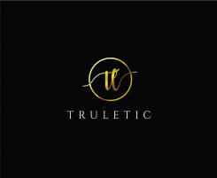
Turletic. Word-(picture-)Logo for sportsfashion & sporty streatwear. Style: unique, exclusive, simple.
- Contest holder: Nibor
- Category: Logo design
- Status: Ended
- Files: File 1, File 2, File 3
Start date: 03-09-2017
Ending date: 10-09-2017
It all started with an idea...
A short, interactive guide helped them discover their design style and clearly captured what they needed.
Brandsupply is a platform where creative professionals and businesses collaborate on unique projects and designs.
Clients looking for a new logo or brand identity describe what they need. Designers can then participate in the project via Brandsupply by submitting one or more designs. In the end, the client chooses the design they like best.
Costs vary depending on the type of project — from €169 for a business or project name to €539 for a complete website. The client decides how much they want to pay for the entire project.
Dear amit kumar,
Would you please change your design a bit? I thought about it and I personally think that only a word-logo would be better. My idea is to keep just the logo you created (the true in the circle) and then to put the "letic" next to it, using the same font as you've used for "tru". An other idea would be that the letters in the word "letic" lose their size as they reach the end of the word. I would be very grateful if you sent me another design. Thank you very much!
The word should be read as a whole, it shouldn´t look like two words.
Hi there,
I send you some message regarding your above feedback. did you get my message? please feedback. I am waiting for your response.thanks
I sent you some message regarding your feedback. did you get my message? please feedback. I am waiting for your response.thanks
Hi, i didn't get any response from you. Waiting for your feedback .thanks
Hi there,
This is my new submission as you said .thanks
Hi there,
This is my proposal for your logo design. I hope you would love it, let me know your reviews and feedback. Thanks
Hi there,
This is my proposal for your logo design. I hope you would love it, let me know your reviews and feedback. Thanks
thank you for your work, i really like both proposals! Could you create just one additional proposal with the initials "tru" instead of "tl"? I`m curious to see this version of the logo. In the end it would be really kind, if you could show me the logo in black color, instead of gold. Thank you very much!
Besides it would be great too, when you could show me a proposal with a more decomposed/imprecise circle arround the initials (just a little bit more)? Thank you very much for your effort!
Thanks
 Nederland
 België
 France
 Deutschland
 Österreich
 United Kingdom
