No comments
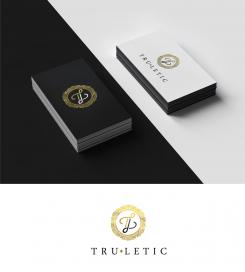
Turletic. Word-(picture-)Logo for sportsfashion & sporty streatwear. Style: unique, exclusive, simple.
- Contest holder: Nibor
- Category: Logo design
- Status: Ended
- Files: File 1, File 2, File 3
Start date: 03-09-2017
Ending date: 10-09-2017
It all started with an idea...
A short, interactive guide helped them discover their design style and clearly captured what they needed.
Brandsupply is a platform where creative professionals and businesses collaborate on unique projects and designs.
Clients looking for a new logo or brand identity describe what they need. Designers can then participate in the project via Brandsupply by submitting one or more designs. In the end, the client chooses the design they like best.
Costs vary depending on the type of project — from €169 for a business or project name to €539 for a complete website. The client decides how much they want to pay for the entire project.
Hello, thank you for the 5 star rating :)
No comments
Hello, I noticed you prefer free fonts than concept designs by designers. So here is my take on the design. this is handwritten.
Please rate 0 on my designs that you dont like so I can
delete them and submit more designs, cause I reached the 15 submissions already, and I want to send new designs. Please rate 0 stars on my other designs you do not like
Thank you artamad!
I disliked some older designs, and i´m looking forward to your new designs you want to submit!
Your last design with the handwritten free font, could be thicker. It`s appearing too filigree, so I think it would attract more women than man. Furthermore I search for something unique, this type of free font, seems to be ordinary. Thank you for your work!
No comments
Any update or changes you want?
No comments
Hello! I hope you like this combination of T and L at the same time can be used as a separate icon that looks amazing :)
Thank you for your effort and your new proposals! I basically really like the logo, especially the hexagon. But for the sports and streatware section, the initials are in my opinion too ornate. Could you please leave the thin endings of the letters out, so its going to appear straighter? Thank you very much
Do you mean like this?
Let me know if I got this right or you need changes, sorry for the confusion
Hello, any updates on this?
Hello, any updates on this?
Do you need anymore changes? :)
No comments
How about these revisions?
Thank you for changing the logo so fast. However there must have been a misunderstanding concerning the diamond: I meant not between the Initials,it should be like a circle surrounding the initials but in the shape of a diamond. Thanks!
How about this?
Thank you for changing the logo. I liked the circle more, though. A diamond around the initials would be great just like the one between "tru" and "letic". You could also use ornamentation similar to the circle. Thanks for your effort!
No comments
Do you need any changes?
Thank you! I really like this logo. However, I need more time to let the logo sink in. Maybe the circle is a little bit too feminin, could you change it in order to make it more unisex? Thank you
No problem, how about the colors? Do you like pure gold. or gold/black?
i prefer the gold/black version
 Nederland
 België
 France
 Deutschland
 Österreich
 United Kingdom
