here adjusted
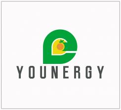
Younergy Logo
- Contest holder: psmiranda
- Category: Logo design
- Status: Ended
Start date: 13-11-2014
Ending date: 22-11-2014
It all started with an idea...
A short, interactive guide helped them discover their design style and clearly captured what they needed.
Brandsupply is a platform where creative professionals and businesses collaborate on unique projects and designs.
Clients looking for a new logo or brand identity describe what they need. Designers can then participate in the project via Brandsupply by submitting one or more designs. In the end, the client chooses the design they like best.
Costs vary depending on the type of project — from €169 for a business or project name to €539 for a complete website. The client decides how much they want to pay for the entire project.
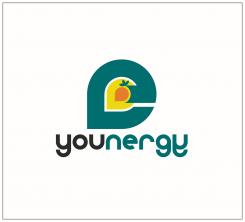
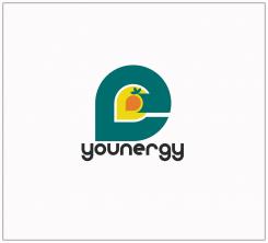
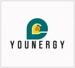
here i make the text lowercase all.. the symbols implys as a sun and a seedling started to grow,.. its outer dark color resembles as letter E as initial for energy .. ..
younergy logo design, design implys a nature friendly energy or simply a natural energy
Hi, thanks for your proposal. I quite like it, specially the last version with darker green. Not sure if I capture the whole idea. It's a bird? Anything else? Can you try it with a rounder font? perhaps lower case. You might want to flip the fist "y" in small case so that it's symmetric with the last "y". Let me know what you think.
Thanks
yeah.. iwill try .. how about all lowercase text?.. i will be back later for that for you to see ..
yes.. it could be somehow a chick a new life living with nature.. or as a seedling living under the sun... this is how i interpreted the design :)
 Nederland
 België
 France
 Deutschland
 Österreich
 United Kingdom
