No comments
Corporate identity and logo ICT company
- Contest holder: stef.schenkelaars
- Category: Logo & stationery
- Status: Ended
Start date: 13-07-2015
Ending date: 01-08-2015
It all started with an idea...
A short, interactive guide helped them discover their design style and clearly captured what they needed.
Brandsupply is a platform where creative professionals and businesses collaborate on unique projects and designs.
Clients looking for a new logo or brand identity describe what they need. Designers can then participate in the project via Brandsupply by submitting one or more designs. In the end, the client chooses the design they like best.
Costs vary depending on the type of project — from €169 for a business or project name to €539 for a complete website. The client decides how much they want to pay for the entire project.
Hello,
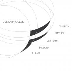
Here is my proposal for your new visual identity. You can see the files in high definition by clicking on the images.
I tried to bring my experience in graphic design to meet your expectations (51 contest won on Brandsupply)
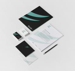
I realized some scenarios to show the potential of the logo.
I hope you will enjoy my work as much as I enjoyed working on your project.
I await your feedback and I remain at your disposal.
Regards
WILKO
Hi Wilko,
To be honest, I do not really like the logo. I think the F does not really adds anything to tho logo and I don't get the idea behind it. I do like the rest of the designs! Especially the black fits in quite well! Maybe another idea for the logo?
Thanks for your input! Stef
 Nederland
 België
 France
 Deutschland
 Österreich
 United Kingdom
