No comments
KHAN.ch Cannabis swissCBD cannabidiol dabbing
- Contest holder: kenotcha
- Category: Logo & stationery
- Status: Ended
- Files: File 1, File 2, File 3
Start date: 09-08-2015
Ending date: 09-09-2015
It all started with an idea...
A short, interactive guide helped them discover their design style and clearly captured what they needed.
Brandsupply is a platform where creative professionals and businesses collaborate on unique projects and designs.
Clients looking for a new logo or brand identity describe what they need. Designers can then participate in the project via Brandsupply by submitting one or more designs. In the end, the client chooses the design they like best.
Costs vary depending on the type of project — from €169 for a business or project name to €539 for a complete website. The client decides how much they want to pay for the entire project.
taking it further to the edge...the cannabis deere...
Is not that but you have good idea and the topi still lovly
thnx for the reply...i will bail out of the contest, succes with your contest.
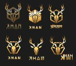
You asked for a suitable logo for small surface, strangly enough you give detailed logo's a higher score...perhaps you must print some of them on the smallest surface that you want to use...so you can see which one will hold stand..
No comments
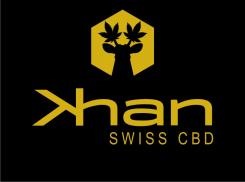
subtile cannabis ears on the deer..
the leaves/ears of cannabis give it also a lofty appearance...like wings ready to take off in to a pleasant feeling.
No comments
thnx for the feedback, sorry for the * just thought not about the Swiss + ...
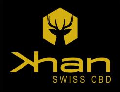
The typo..font is a modern strong font and under license so you will not see it often used.
most important of it all is the need to be recognizable at first glimp and in all sizes
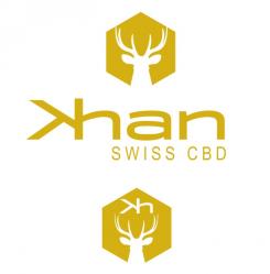
what i like is that by the small logo the Kh looks even more like a deer. (small is also from a further distance)
No comments
cant resist it...leaving the Deer scene and just using the Kh as a logo because it has on his own a strong appearance...giving it a more branding effect and incl. the * giving it a modern look...not the traditional medical/pleasure/smoking sign
No comments
alternative deer made from the K and h...simple but very recognizable, not the + but the * for more enjoyment
The "k" for the deer nice, a * why not but + is more swiss !! I like typography you get !
No comments
another version whitout the Kh.
 Nederland
 België
 France
 Deutschland
 Österreich
 United Kingdom
