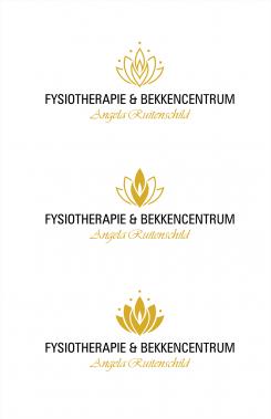
here is my logo proposal. any feedback wold be very much appreciated
Design a modern logo and corporate identity for a practice for specialized physiotherapy
- Contest holder: FBC75
- Category: Logo & stationery
- Status: Ended
Start date: 02-10-2016
Ending date: 09-10-2016
It all started with an idea...
A short, interactive guide helped them discover their design style and clearly captured what they needed.
Brandsupply is a platform where creative professionals and businesses collaborate on unique projects and designs.
Clients looking for a new logo or brand identity describe what they need. Designers can then participate in the project via Brandsupply by submitting one or more designs. In the end, the client chooses the design they like best.
Costs vary depending on the type of project — from €169 for a business or project name to €539 for a complete website. The client decides how much they want to pay for the entire project.
I like it! Reminds me of a flower and the contours of the lower body.
Because of the middle part i think it's to feminin fot the male patients i have. If i only had female patients. I had definitly had picked this one. I think my name in the same color as the logo.
hi!. glad you liked it, i can make some revision of this one but the contest already ended and i can't pass anymore design
send me email or drop message on my inbox. i am open for revision on this logo. thanks!
 Nederland
 België
 France
 Deutschland
 Österreich
 United Kingdom

