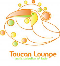
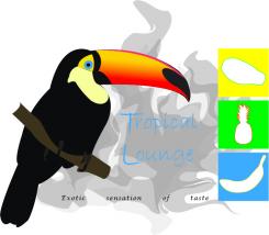
I made this Logo . If it fits , I'll post the master slide .
Logo & Slogan & Color Concept & Slide Master
- Contest holder: toucan lounge
- Category: Logo & stationery
- Status: Ended
Start date: 10-10-2012
Ending date: 10-11-2012
It all started with an idea...
A short, interactive guide helped them discover their design style and clearly captured what they needed.
Brandsupply is a platform where creative professionals and businesses collaborate on unique projects and designs.
Clients looking for a new logo or brand identity describe what they need. Designers can then participate in the project via Brandsupply by submitting one or more designs. In the end, the client chooses the design they like best.
Costs vary depending on the type of project — from €169 for a business or project name to €539 for a complete website. The client decides how much they want to pay for the entire project.
Hello, thank you for your design!
However, it's still a long way to go...
Here are some suggestions concerning your design, which will point out the direction in which we want to go:
The name of the startup is "toucan lounge" and not “tropical lounge“. However, a tropical and exotic impression should be generated via the logo.
The slogan “exotic sensation of taste“ should not be in the logo (please also refer to the requirements description).
However, concerning the slogan in general: We don‘t like blue as a color. Moreover, the letters appear too thin and it‘s hard to read.
Generally, the elements of the design (toucan, cloud of smoke, fruits) do not seem to interact well. They should go well together!
Concerning the toucan: The toucan shouldn‘t look like an actual, real-life toucan. It should be presented in a modern and simplified way. Moreover, we‘d like the idea that the toucan is presented in a colorful way. The toucan‘s black is too dark and doesn‘t fit the brand‘s overall idea.
Concerning the cloud of smoke: We responded to the idea that the Toucan is in front of the cloud of smoke, respectively that the cloud of smoke is in the toucan‘s back. However, the cloud of smoke should look friendlier and nicer. Also, we thought it would be a nice idea to introduce a colored colorful of smoke.
Concerning the fruits: The fruits on the right side appear as too distanced and not really necessary. Also, they are not sound with the elements and appear rather as alien elements. It is the goal to embed the fruits in the overall logo: toucan, the cloud of smoke and the fruits should go well together! In addition, please don‘t put emphasis/focus on specific fruits (in your case, pineapple and so on) since we don‘t know if we‘ll offer this flavor in our range of products; try to rather display a variety of fruits or just hint at fruits in a minimalist way.
Concerning the overall logo: Try to bring focus to the logo. Right now everything looks a little too “mixed“. We guess that putting the entire design into a circle might bring focus to the idea.
Again, thank you very much for your efforts.
We are looking forward to your improvements.
All the best!
The Toucan Lounge Team.
 Nederland
 België
 France
 Deutschland
 Österreich
 United Kingdom

