No comments
Are you ready to be displayed?
- Contest holder: louiseduif
- Category: Logo & stationery
- Status: Ended
Start date: 10-08-2017
Ending date: 24-08-2017
It all started with an idea...
A short, interactive guide helped them discover their design style and clearly captured what they needed.
Brandsupply is a platform where creative professionals and businesses collaborate on unique projects and designs.
Clients looking for a new logo or brand identity describe what they need. Designers can then participate in the project via Brandsupply by submitting one or more designs. In the end, the client chooses the design they like best.
Costs vary depending on the type of project — from €169 for a business or project name to €539 for a complete website. The client decides how much they want to pay for the entire project.
Goodmorning,
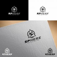
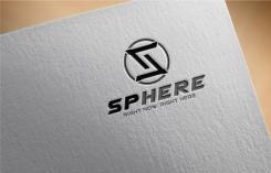
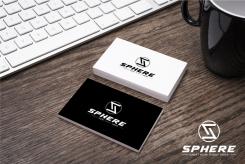
Here is my work for your new visual identity. You can see the files in good quality by clicking on the images.
I bring my experience in graphic design to create a powerful and distinctive logo. I hope you will enjoy my work as much as I enjoyed working on your project.
I await your feedback and I remain at your disposal.
Best regards
whitecat
Goodmorning Whitecat,
First I want to thank you for your work! About the logo's, I think that the first two of your designs don't really communicate our business vision the way I want it. The third logo is a little too busy in my opinion.
Anyway, thanks for your effort again and keep up the good work!
Thnax for your feedback .... 3rd logo is not busy as it is in your top 5 rated ones .... any ways it is your choice
 Nederland
 België
 France
 Deutschland
 Österreich
 United Kingdom


