Create a style and logo - with care - for bikes

Start date: 21-05-2013

Ending date: 31-05-2013

Total budget: € 349.00
Latest design
Book cover
Huis van Maartje

It all started with an idea...

A short, interactive guide helped them discover their design style and clearly captured what they needed.

Needs


Create an exciting and attractive logo and style for a mobile bicycle repair service in Amsterdam.
Services may be extended in the future to selling (customised) bikes and fixies.

Logo will in first place be used for business card, flyer and FB page. Later for website and company vehicle or stickers on bikes.

Company description


BiciCare:
- Bici stands for Bicycle and comes from Italian (the bike repair man is Italian)
- Care stands for attention and care for the bike (a unique selling point)

Description:
Does your bike need a bit of Care? BiciCare maintains and repairs your bike with attention; as if it was our own bike. And we are happy to come your way, so you save yourself some time and trouble. Your bike is our Care: BiciCare!

Services:
Now: reparations, healthcheck, Care maintenance, mounting online ordered bikes, accessory fixing, service contracts for company or hotel bikes.

Last but not least, the entrepeneur was a professional chef for 15 years. He is making a careerswitch. We may take this theme on board with e.g. pictures to show tools of both professions. Connection is precision, perfection, passion.

Target group


People in Amsterdam, living or working who own a bike and want to take care of it. They like the convenience of a repair service on location. All ages, but mostly 25-50, online and on social media.

Colors, favourites and other requirements


We are thinking of 2 typefaces for the word BiciCare.
Bici: professional, precise, stands for the bike and the tools
Care: Warm and soft, for the caring and attention

Logo must be self explanatory and better than current similar services.
Most competitors use a bike or a wheel and a lot of orange colour is used. So please NO orange.

It can be a bit playful, but needs to be stylish too.

Possible direction we were thinking for later on the web or banners: white bike on white background, sterile and clean with warm logo (not red as too much red cross alike). Other ideas welcome.

Designer: mikidejanovic mikidejanovic
logo-vizitkarte-memorandumi-dizajn-mikidejanovic-gk6XUCsS

No comments

This contest is finished. Its not possible to reply anymore.
logo-vizitkarte-memorandumi-dizajn-mikidejanovic-deVvSovQ

No comments

This contest is finished. Its not possible to reply anymore.
logo-vizitkarte-memorandumi-dizajn-mikidejanovic-U4YHGB9M

No comments

This contest is finished. Its not possible to reply anymore.
logo-vizitkarte-memorandumi-dizajn-mikidejanovic-NtN3DPFI

No comments

AnnieAnnie

Nice variations and iconic design. Too 'classy' for our taste.

AnnieAnnie

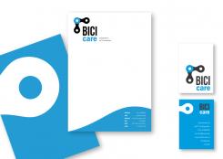
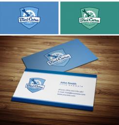
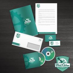
Hi Miki, can you show us this one with more 'outspoken' colours, direction blue or green. And can you see if we can make the icon a bit less 'busy' by maybe removing the white border or some of the text on the bottom? How would this logo look like on a business card or housestyle?

This contest is finished. Its not possible to reply anymore.
logo-vizitkarte-memorandumi-dizajn-mikidejanovic-11bJRwq8

No comments

AnnieAnnie

Also nice, too much detail though

This contest is finished. Its not possible to reply anymore.
logo-vizitkarte-memorandumi-dizajn-mikidejanovic-ykW9miLg

No comments

Huis van MaartjeHuis van Maartje

Beetje jammer dat je het idee van een hart en kruis in de wielen van een andere ontwerper in deze wedstrijd hebt gestolen.

mikidejanovicmikidejanovic

Ja, ik zie nu dat sommige van mijn werk met elkaar samenvallen, zodat hun werken terug te trekken uit de competitie. Dit kan zijn omdat hij opgemerkt, maar als de klant dat geen rekening wordt gehouden.

AnnieAnnie

Thanks for your design entry. Nice one, not quite the colours though. I dont understand your feedback to huisvanmaartje, can you please explain again?

mikidejanovicmikidejanovic

I got out of the huisvanmaartje I used some elements of (heart and cross) that are used by other designers before me. So I deleted some of his work to this competition, not to make it look like I stole someone else's idea. Sorry, I do not speak English well, but I hope you understand this.
Regards, Miki

This contest is finished. Its not possible to reply anymore.