No comments
Create a style and logo - with care - for bikes
- Contest holder: Annie
- Category: Logo & stationery
- Status: Ended
Start date: 21-05-2013
Ending date: 31-05-2013
It all started with an idea...
A short, interactive guide helped them discover their design style and clearly captured what they needed.
Brandsupply is a platform where creative professionals and businesses collaborate on unique projects and designs.
Clients looking for a new logo or brand identity describe what they need. Designers can then participate in the project via Brandsupply by submitting one or more designs. In the end, the client chooses the design they like best.
Costs vary depending on the type of project — from €169 for a business or project name to €539 for a complete website. The client decides how much they want to pay for the entire project.
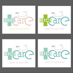
Hello! I'm back with some new proposals, simplified regarding my first design. I made some test to integrate a chainring in the bici police. I also tried to different fonts for the bici technical part. Some tests are with and others without the pedalboard. I also tried different colors assembly. Please feel comfortable in telling me what you like and what you don(t like. Sincerely,
Arago24
Hi
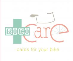
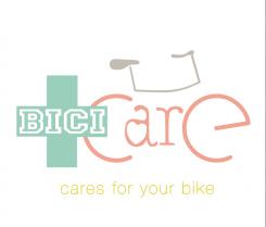
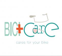
Here is my proposal for your logo, based on your brief. My logo integrates a stylistic bike in the name bici care, with a touch of humour (pedalboard on the r of care). The font used for BICI is regular and straight (technical part of your activity) while the font used for care is round, manual to emphasize the care you take and the handmade, customised side of your service. Please let me know how you feel with my proposal, which of course I can modify to feet your expectation (I'm sorry for my english which is not very good!...).With Regards,
Arago24
Thanks for your design. Your English is great, dont worry! The logo has nice details, but overall it's also too many things happening which makes the whole too messy in my opinion. The red cross is especially disturbing, it asks too much attention.
Thanks for your return. You're right, it's too complicated. I'm going to rework and simplify.Good night!
 Nederland
 België
 France
 Deutschland
 Österreich
 United Kingdom
