Good evening Franck,
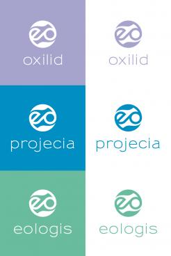
attached you find a new variation of your favorized proposal of mine.
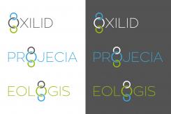
This way the "o" builds the overall frame/circle around the two child companies projecia and eologis and at the same time reflects the ecological background. Hope you like it. Whenever you want see the according housestyle or any changes please let me know.
Kind regards, Dagmar
Creation of a common logo for real estate, investment and housing.
- Contest holder: franck de projecia
- Category: Logo & stationery
- Status: Ended
- Files: File 1, File 2, File 3
Start date: 19-04-2017
Ending date: 03-05-2017
It all started with an idea...
A short, interactive guide helped them discover their design style and clearly captured what they needed.
Brandsupply is a platform where creative professionals and businesses collaborate on unique projects and designs.
Clients looking for a new logo or brand identity describe what they need. Designers can then participate in the project via Brandsupply by submitting one or more designs. In the end, the client chooses the design they like best.
Costs vary depending on the type of project — from €169 for a business or project name to €539 for a complete website. The client decides how much they want to pay for the entire project.
Hello Franck,
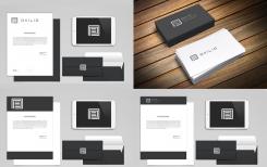
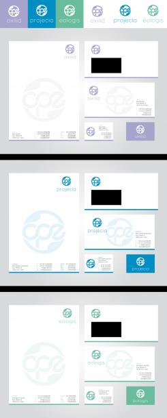
attached you find the three different layouts for the housestyle designs for oxilid, projecia and eologis. I changed the letters to small caps in this proposal, in case you should prefer these. If you like to see other color or lettertype options, please let me know.
ind regards, Dagmar
New variation, similar style,
kind regards, Dagmar
Good morning Franck,
thank you again for your positive rating. Attached a first layout for an according housestyle for OXILID. If you would like different colors, I will change it if requested. Sorry I didn't really understand the words “votre travail dans une maquette “, could you try to explain this in english?
Have a nice weekend & kind regards, Dagmar
Hello DAGMAR,
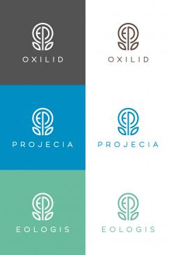
Your work is perfect circular logo with the leaves in place of the arrows is perfect. You have perfectly understood mockup in English what said "maquette" in french, what you did. The last 2 logos presented suited me much less. You have been selected for the final decision that will be made with my associates.
Again thank you for your work and see you soon. I'll contact you at the end of the vote.
Regards,
Franck
Hello Franck,
attached a version with stylized leafs instead of the arrows, maybe this fits better?
Kind regards, Dagmar
Merci beaucoup Dagmar, très bon travail, si vous êtes choisi accepteriez vous d'intégrer votre travail dans une maquette
Au plaisir de vous lire.
No comments
The arrows I suppose evoke sustainable development. That's good but I would have preferred the ecology with rather a stylized tree leaf or other.
Regards,
Franck
Second layout in similar style,
regards Dagmar
Thank you dagmar and bravo can work on the colors
Hello Franck,
thank you for your feedback and rating. Attached a variation of my second proposal. If you have any particular wish, that could improve the design, please let me know.
Kind regards, Dagmar | VirtualLies
Hello virtuallies, i prefer the first, I do not know what to say, your work is interesting but I would like something more in the era of time, kind regards, Franck
No comments
Bonjour et merci pour le travail, l'idée est très interessante.
 Nederland
 België
 France
 Deutschland
 Österreich
 United Kingdom
