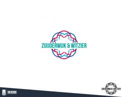
Hello!
I try to make a version with all revision samples in it. Cause here at brandsupply we are only allowed to send 15 submissions. Any thoughts?
Cutflower nursery searching for a new corperate identity and logo
- Contest holder: Luke Zuijderwijk
- Category: Logo & stationery
- Status: Ended
Start date: 08-11-2016
Ending date: 22-11-2016
It all started with an idea...
A short, interactive guide helped them discover their design style and clearly captured what they needed.
Brandsupply is a platform where creative professionals and businesses collaborate on unique projects and designs.
Clients looking for a new logo or brand identity describe what they need. Designers can then participate in the project via Brandsupply by submitting one or more designs. In the end, the client chooses the design they like best.
Costs vary depending on the type of project — from €169 for a business or project name to €539 for a complete website. The client decides how much they want to pay for the entire project.
Hi,
The logo is not what we are looking for. It is too much and our company name does not have to be so obvious in the logo. I think you should look for a completely different design.
No comments
I like this one a bit better than the other one, beceause it is a bit more notable. The colours are a bit to dark and for us it is a bit to much in this form.
What colors do you prefer? :) warm?
No comments
Hi,
For the former logo and a bit more inspiration you could have a look on our website www.gerberazuijderwijk.nl
For our logo we are looking for a logo that is obvious by itself, the name of the company doesn't have to be very obvious in the logo. I think this logo doesn't distinguish enough.
No comments
Hi,
Ik like the modern look of the design, but I would like it a bit closer to our company. This design really could be for any company and I like a logo to tell a little bit about the company.
Can I see your former logo? I cant seem to find it. SO I can have a reference
 Nederland
 België
 France
 Deutschland
 Österreich
 United Kingdom
