No comments
Design a catchy logo for the fitness and health sector
- Contest holder: Martin Gangl
- Category: Logo & stationery
- Status: Ended
- Files: File 1
Start date: 13-01-2020
Ending date: 20-01-2020
It all started with an idea...
A short, interactive guide helped them discover their design style and clearly captured what they needed.
Brandsupply is a platform where creative professionals and businesses collaborate on unique projects and designs.
Clients looking for a new logo or brand identity describe what they need. Designers can then participate in the project via Brandsupply by submitting one or more designs. In the end, the client chooses the design they like best.
Costs vary depending on the type of project — from €169 for a business or project name to €539 for a complete website. The client decides how much they want to pay for the entire project.
Spectacular and innovative version of your logo that follows the graphic line as the example of Adidas but in a completely different and exclusive version.
Dear Martin, can you take away a curiosity? Why did you evaluate all my works at 1 star and at most 2? I don't see what's so bad. Maybe I dislike you because I'm Italian? :-)
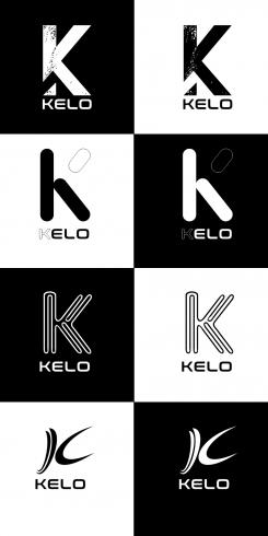
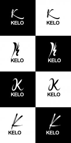
this is a graphic solution consisting of 4 different logos in black and white and negative. Please indicate your preferred logo to present other mockup examples with the same logo. Thank you
No comments
thank you for your help. can you make the K something different? It's a little too much for me.
ok this is only the first test. I hope to do even better.
 Nederland
 België
 France
 Deutschland
 Österreich
 United Kingdom
