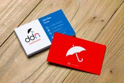
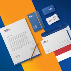
This is the stationery design alternative using the logo I suggest. Further details or adjusments can be discussed.
Regards,
Robby
Design a fresh logo and corporate identity for DDN Assuradeuren, a new player in the Netherlands
- Contest holder: josalma
- Category: Logo & stationery
- Status: Ended
Start date: 06-05-2020
Ending date: 13-05-2020
It all started with an idea...
A short, interactive guide helped them discover their design style and clearly captured what they needed.
Brandsupply is a platform where creative professionals and businesses collaborate on unique projects and designs.
Clients looking for a new logo or brand identity describe what they need. Designers can then participate in the project via Brandsupply by submitting one or more designs. In the end, the client chooses the design they like best.
Costs vary depending on the type of project — from €169 for a business or project name to €539 for a complete website. The client decides how much they want to pay for the entire project.
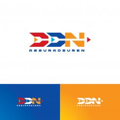
The logo offers a fresh yet solid impression in order to differentiate DDN from the others. The negative space suggests arrow shapes to represent guidance, straight forward and progressiveness. The typeface is bold and solid to symbolize trustworthy or bonafide. The colors are warm and fresh, to show the DDN intention to connect sincerely with their clients and bring a new different energy.
Regards,
Robby
 Nederland
 België
 France
 Deutschland
 Österreich
 United Kingdom


