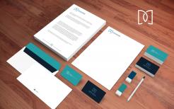
@demakers :exemple on stationery
design a Logo and style for an Interior and Furniture Maker
- Contest holder: demakers
- Category: Logo & stationery
- Status: Ended
Start date: 17-01-2018
Ending date: 30-01-2018
It all started with an idea...
A short, interactive guide helped them discover their design style and clearly captured what they needed.
Brandsupply is a platform where creative professionals and businesses collaborate on unique projects and designs.
Clients looking for a new logo or brand identity describe what they need. Designers can then participate in the project via Brandsupply by submitting one or more designs. In the end, the client chooses the design they like best.
Costs vary depending on the type of project — from €169 for a business or project name to €539 for a complete website. The client decides how much they want to pay for the entire project.
@demakers, thanks for your feedbacks, i guess i won't be able to do better than the one you rate 5 stars ( it's absolutely not my kind of style ) maybe you can give me some more hint so i can make another try.
Maybe you would like another font or color scheme ?
sorry, we have chosen, I rated you for the nice design, It looks pretty good, only the other one we prefer. thank you so much for your effort.
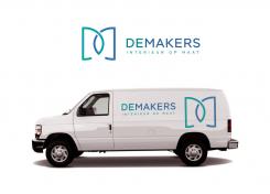
@demakers, exemple on truck stickers.
As there is a double "D" , it stands as "De Makers Design"
@demakers , exemple on icons ( for website, Facebook, twitter, stickers ...)
Picto only, very catchy and easy to use on any supports.
Hello @demakers, here my design with this simple and modern "D" & "M" monogram.
 Nederland
 België
 France
 Deutschland
 Österreich
 United Kingdom
