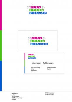
Here is My design. Can add more shapes or add a background if necessary. It looks Modern, Fresh and it definitely look good on any sort of folder or letter etc. Please give me feedback.
Design a logo and style for Play Learn Change
- Contest holder: JelledeJong
- Category: Logo & stationery
- Status: Ended
Start date: 13-02-2015
Ending date: 20-02-2015
It all started with an idea...
A short, interactive guide helped them discover their design style and clearly captured what they needed.
Brandsupply is a platform where creative professionals and businesses collaborate on unique projects and designs.
Clients looking for a new logo or brand identity describe what they need. Designers can then participate in the project via Brandsupply by submitting one or more designs. In the end, the client chooses the design they like best.
Costs vary depending on the type of project — from €169 for a business or project name to €539 for a complete website. The client decides how much they want to pay for the entire project.
Your logo defenitely has a good appearance. Could you tell a little bit about how you connect this logo to our pitch?
Its mainly the colours. It links to how education varies. Like the tear drop under the 2 circles, that shows the development in "techniques" as you said in your pitch. I think this shows that your company is structured and strategic due to the position of the text. Hope you like it.
 Nederland
 België
 France
 Deutschland
 Österreich
 United Kingdom

