No comments
Design a new logo & CI for “Dukes of Data
- Contest holder: DoD´s
- Category: Logo & stationery
- Status: Ended
Start date: 30-07-2018
Ending date: 15-08-2018
It all started with an idea...
A short, interactive guide helped them discover their design style and clearly captured what they needed.
Brandsupply is a platform where creative professionals and businesses collaborate on unique projects and designs.
Clients looking for a new logo or brand identity describe what they need. Designers can then participate in the project via Brandsupply by submitting one or more designs. In the end, the client chooses the design they like best.
Costs vary depending on the type of project — from €169 for a business or project name to €539 for a complete website. The client decides how much they want to pay for the entire project.
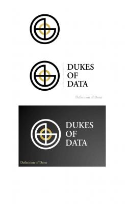
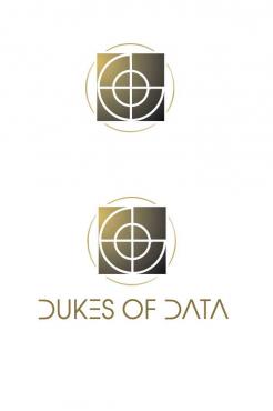
I send a further design reduced in all elements... a modern interpretation of heraldry.
kind regards
lamby
Hi lamby,
thanks a lot for your new idea.
It is cool as one of the Ds merge into the rand circle. The second D is a bit too close and does not connect - therefor it is floating without any touch.
I can imagine that this easily transforms in some kind of wave in the circle, which would be cool - but does not help us :)
But you are on the right track,
keep it going,
thanks,
cheers,
joe
No comments
Hi lamby,
these versions are the best of all your designs.
My personal favorit is the middle one.
Anyway - as mentioned before, this does not fit our requirements yet.
Thanks a lot and keep on going,
cheers
joe
thanks for your comment!
I think you fail to notice the two „D" and in the centre the „0" (DoD)
For the target a quarter of the circle isn't exist!
Anyway fist of all the logo has a strong impact.
I send a further design reduced in all elements... a modern interpretation of heraldry.
kind regards
lamby
No comments
Hi lamby,
thanks for these design.
The "definition of done" is not needed in our logo - at least not as a seperate sentence.
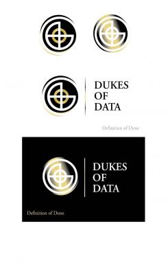
The gradiant in the background seems not to fit the shape of the circles. All in all, the logo is more a target than a business logo.
But thank you for your work and effort, you put into the creation.
Cheers
joe
No comments
Hi lamby,
thanks for your logos. Nice to see another direction.
It is derived from a target, right? Well, we think this might fit any military company way better then us.
The other issue we do have is the color gradient. This does not fit our idea of a simple, clean logo so far.
Thanks a lot for your work, keep it going!
Cheers
joe from Dukes of Data
 Nederland
 België
 France
 Deutschland
 Österreich
 United Kingdom
