No comments
Design a new logo & CI for “Dukes of Data
- Contest holder: DoD´s
- Category: Logo & stationery
- Status: Ended
Start date: 30-07-2018
Ending date: 15-08-2018
It all started with an idea...
A short, interactive guide helped them discover their design style and clearly captured what they needed.
Brandsupply is a platform where creative professionals and businesses collaborate on unique projects and designs.
Clients looking for a new logo or brand identity describe what they need. Designers can then participate in the project via Brandsupply by submitting one or more designs. In the end, the client chooses the design they like best.
Costs vary depending on the type of project — from €169 for a business or project name to €539 for a complete website. The client decides how much they want to pay for the entire project.
Hi moinjaved,
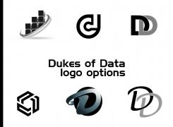
thanks for a bunch of options.
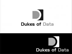
Is anything wowing us? Not really. If we have to choose from all of these, we would go for the cube in the left lower corner.
But I am not sure, what's needed to make this one work.
Thanks a lot
cheers
joe
No comments
Hi moinjaved,
thanks a lot for this one.
Sorry, but this one does not work either. The font is not modern and slick enough, the Ds of the logo too.
Thanks anyway,
cheers
joe
No comments
Hi moinjaved,
thanks again. But it is a variation of the last one, right?
So the same here... too much going on, to unclear in the message.
Cheers
joe
No comments
Hi moinjaved,
thanks for something completly different.
Is this the contour of a devil with data-cubes as hairs?
Sorry, but there is too much ongoing, to much different shades of grey.
But thanks a lot for showing your ideas, your effort and work are really apprechiated by us.
Cheers
joe
No comments
Hi moinjaved,
thanks for another one.
This mixture of bitcoin logo and the space ship of asteroids does not fit our needs :) But it made me smile at least.
Thanks a lot
cheers
joe
No comments
Hi moinjaved,
Thanks for this entry.
Although this is a dynamic D, it does not appeal to us very much. It's great to see something else from you, but I am sorry, this is the wrong way.
But thanks anyway,
cheers
joe
No comments
Hi moinjaved,
thanks for you next entries.
This one combines the simplicity with a D in a box. With the different shades it has a structure.
It is better then the last ones - great to see improvment here.
Cheers
joe
No comments
Hi moinjaved,
thanks for this one.
It is easy to say, this one has a twist :)
Therefor it functions a 3d D-version without color gradiant, which we do like.
But again, there is no wow-effect with this one.
Thanks and keep it going!
cheers
joe
No comments
Hi moinjaved,
thanks for showing something else.
We can see a development in your ideas as you go along.
The shiny part is a bit too much, the D alone is simple, but it seems so simple, it is replaceable.
Unfortunatly this does not hit us in any case.
Thanks a lot
cheers
joe
No comments
Hi moinjaved,
thanks for showing us the inverted version.
Interesting for us, it has lost gravity and character. Although it appears lighter, it is lost in the white space. The bold black square was keeping it in place, but putting on a lot of black.
Thank you
cheers
joe
No comments
Hi moinjaved,
thanks for this one, based on the feedback.
It seems that is will not work for us, sorry.
But it is so much better to see some variations before putting an idea down. Especially when someone put in some work as you did.
Thanks a lot,
cheers
joe
No comments
Hi moinjaved,
thanks a lot for entering 3 different ideas.
We like to see this kind of diversity. The issues with this one are: the symbol is too close to the letters, more space will make it lighter and floating.
We are concerned that fine lines will not work with bad screen resolutions or t-shirt prints. Yours does have a nice 3d effect with these shades of grey, but we think this is too filigree.
Thanks a lot,
cheers
joe
high quality files will send after choose winner. changes you want ll be made.
thanks
No comments
Hi moinjaved,
this one is quite interesting. Something very new, something we have not seen so far.
Can we ask for another version? Instead of the big black block, invert the colors. And put the Dukes of Data in 3 lines next to it please.
That would be great. This idea made us curious and looking twice. That's nice.
Thank you,
cheers
joe
No comments
Hi moinjaved,
thanks for entering our competition with your ideas.
We will give you feedback on every one itself, so you see what's working for us.
This one does not click with us anyway. It looks like a racing paperclip. We can see the idea of going with the Ds in a O round shape, it just don't work for us.
The font is fine, it is clear and simple, but no wow-effect so far.
But thanks a lot for your effort,
cheers
joe from Dukes of Data
 Nederland
 België
 France
 Deutschland
 Österreich
 United Kingdom
