Hello,
I offer you a last try Let me tell you (and this especially without affecting your judgment of the logo), that your comments are exceptional, and I say a big THANK YOU for devoting this time to advise us, or to thank us (and this is the first time I see it;)
Regards NANO
Design a new logo & CI for “Dukes of Data
- Contest holder: DoD´s
- Category: Logo & stationery
- Status: Ended
Start date: 30-07-2018
Ending date: 15-08-2018
It all started with an idea...
A short, interactive guide helped them discover their design style and clearly captured what they needed.
Brandsupply is a platform where creative professionals and businesses collaborate on unique projects and designs.
Clients looking for a new logo or brand identity describe what they need. Designers can then participate in the project via Brandsupply by submitting one or more designs. In the end, the client chooses the design they like best.
Costs vary depending on the type of project — from €169 for a business or project name to €539 for a complete website. The client decides how much they want to pay for the entire project.
Hi Nano,
thanks for another entry.
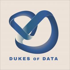
This one is very special. It comes with this 3d figures, they are impossible moebius ones. Thats awesome.
Unfortunately we are looking for something simple, which can be instantly remembered and drawn by heart after a first glance.
If I ever write a book, this would make a great mind-fu*king cover.
at giving feedback: nice from your side to mention it. But we really do think, it is so important to give feedback and show you all the respect for your work.
All entries does contain thinking, putting work and sweat to get it outside the head and on paper and it really does need courage to put it online for judgment.
I hope, you will see something like that more from others too.
Thanks for your participation,
best regard & cheers
joe
No comments
Hi Nano,
thanks for this one.
We see that you took our feedback to come up with something new and fresh.
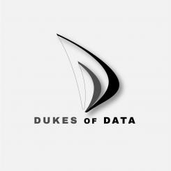
Sadly it is too much sailing and boomerang. So it does not work for us in our business and ideas.
Thanks a lot for your work anyway.
Cheers
joe
No comments
Hi NANO,
thanks for the second proposal.
Sorry, but it is not better than the previous one.
The feedback would be the same.
Thanks
cheers
joe
Hello,
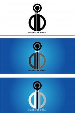
here is my proposition,
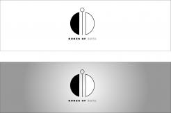
I wanted to represent 2 D IN THE O at the top, all in perfect connection (bow tie);
we can see a character in costume;
I remain at your disposal,
Sincerely NANO
Hi NANO,
thanks for entering our competition.
We can see the person, the man you did with Ds and Os. It made me smile. But unfortunatly it would not work.
The shades are too much, the proportions do not fit, the figure is funny but does not connect to our work.
But thanks a lot,
we apprechiate your work and effort
cheers
joe from Dukes of Data
 Nederland
 België
 France
 Deutschland
 Österreich
 United Kingdom
