No comments
Design a new logo & CI for “Dukes of Data
- Contest holder: DoD´s
- Category: Logo & stationery
- Status: Ended
Start date: 30-07-2018
Ending date: 15-08-2018
It all started with an idea...
A short, interactive guide helped them discover their design style and clearly captured what they needed.
Brandsupply is a platform where creative professionals and businesses collaborate on unique projects and designs.
Clients looking for a new logo or brand identity describe what they need. Designers can then participate in the project via Brandsupply by submitting one or more designs. In the end, the client chooses the design they like best.
Costs vary depending on the type of project — from €169 for a business or project name to €539 for a complete website. The client decides how much they want to pay for the entire project.
No comments
Dear Joe,
i work on new proposal for logo desing.
Thank you for feedback.
Greetings,
Milla
No comments
Dear,
Thank you for comment, i work that logo be unique more, what you think, if you have any suggestion feel free to write
Greetings,
Milla
Hi Milla,
thanks for another entry.
It is nice to see that you played with your idea and made another version.
Unfortunately the last one was better in the way of keeping it simple. Although we do have the same concerns that is may lose meaning without the "dukes of data".
Suggestions... uh, that is hard. Maybe sort the logos of the contest and let the high rated inspire you :)
Cheers
joe
No comments
Hi Joe,
I understand your requirements. Thank you lote for feedback. What you think about new design?
Greetings,
Milla Lekic
Hi Milla,
our first thought: simplicity to the max. Really, this is breaking everything down to one clear, simple design. Love it.
What we worry about is, that the icon alone does not have any recognizion in it. If we leave the letters away, can we link it to Dukes of Data?
We are not sure about this. But you are definitiv on the right page with this enty.
Thanks a lot
cheers
joe
No comments
Hi Joe,
My new proposal for logo design. what you think?
Greetings,
Milla
Hi Milla,
honestly, the first two designs fits our expectations far better than this one.
We can see the connection between the font and the squares but both are not so clear and slick than the first ones.
But - thanks a lot for showing this proposal and the work you put into it.
It's good to see if something works or it don't.
Keep up your good work,
cheers
joe
No comments
Hi,
although this is clear and simple, we don't like the orange part. Unfortunately it reminds us of an out-of-date logo we have seen long time ago.
But it is something different to you other designs and stands out in this line. Again your choice of font is well done, the symbol is not quite there.
Thanks a lot,
joe
Dear Joe,
Thank so much for feedback, I'll work on your suggestion and upload new design.
Greetings,
Milla Lekic
No comments
Hi,
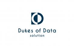
this variation of the first D/O letter combination comes very simple. Again, the "Solution" is not needed here.
I like the invert version as we can see both at one glance. The font is excellent, it reminds me of a bauhaus style font.
What we miss is some kind of surprise, of wow-ing. But again, thanks a lot, it is a brave move to come up with some ideas in the first place.
Cheers,
joe
No comments
Dear,
Here is my work for your new visual identity. You can see the files in good quality by clicking on the images.
I tried to bring my experience in graphic design to create a powerful and distinctive logo. I hope you will enjoy my work as much as I enjoyed working on your project.
I await your feedback and I remain at your disposal.
Greetings,
Milla Lekic
mymyfamous@gmail.com
Hi Milla,
Thanks for you contributions. We appreciate your submissions, as we can see your main idea: playing with D and O in different combinations.
@this design: it has a clear symbol and a well thought structure. However, we don't want a "solution" in the logo as "Dukes of Data" should work overall.
Also the font is nice - something differnt to all the standard sans-serifs.
But it's a great start and strong first try. It just does not click. Take some inspiration from the other submissions and keep your clear structure.
Thanks a lot,
joe from the Dukes of Data Team
 Nederland
 België
 France
 Deutschland
 Österreich
 United Kingdom
