No comments
Design a new logo & CI for “Dukes of Data
- Contest holder: DoD´s
- Category: Logo & stationery
- Status: Ended
Start date: 30-07-2018
Ending date: 15-08-2018
It all started with an idea...
A short, interactive guide helped them discover their design style and clearly captured what they needed.
Brandsupply is a platform where creative professionals and businesses collaborate on unique projects and designs.
Clients looking for a new logo or brand identity describe what they need. Designers can then participate in the project via Brandsupply by submitting one or more designs. In the end, the client chooses the design they like best.
Costs vary depending on the type of project — from €169 for a business or project name to €539 for a complete website. The client decides how much they want to pay for the entire project.
Hi amana,
thanks for another entry.
The font in black is clear and structures, although very common and with serifs.
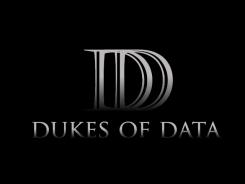
The cube is new idea, but with the 3d shape it is impossible to see the Ds without zooming in.
We really apprechiate your work, your energy and your ideas. Sadly, non did work for us so far.
Thanks and keep it going,
cheers
joe
No comments
Hi amana,
thanks for another entry.
Adding the hands to the previous logo did not help in any kind. The hands, like wings do remind us of social helping organisations or churches.
So this one won't work either.
Cheers
joe
No comments
Hi amana,
thanks for another entry.
Interesting your switch from the black and grey scale to colors. :)
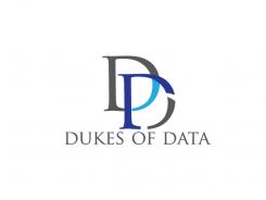
Unfortunately this one does not work either. We can see the DD and the arrow into it. But it does not connect, we can't see our company represented by this logo.
Thanks a lot,
cheers
joe
No comments
Hi amana,
thanks for another entry.
It is the same here as at the last one. The contrast is absolute too low, the white lines add some dynamic, but it does not work.
Thanks anyway,
cheers
joe
No comments
Hi amana,
thanks a lot for another idea.
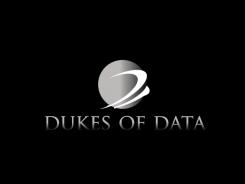
This one does not fit our requirements. The words and the symbol disappear in the black background, the font is not modern enough.
Sorry, but keep it going,
cheers
joe
No comments
Hi amana,
thanks for coming up with new ideas,
It is so hard, to create an outstanding DD logo. Unfortunatly this one does not work for us.
But thank you for showing, we really apprechiate your effort and work you put in here.
Cheers
joe
No comments
Hi amana,
thanks a lot for showing us something else.
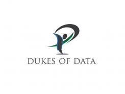
This shows more dynamics then the last one. It is a walking/running person with a shape over the head. This could be a D, but it is hard to see.
We don't get the message alone with looking at it. Are we fleeing? Are we competing?
Thanks a lot for your effort, but sadly, this one would not work for us.
Feel free to show us more your ideas/works.
Cheers
joe
No comments
Hi amana,
thanks for sharing another idea.
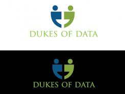
We can see two persons, reaching hands and showing a big smiling face. So this is a very friendly logo, also with these colors blue and green.
The problem with the colors are shown in the dark version. The contrast fades and it is hard to see.
This logo would fit a community or a face-to-face consulting company much better than us - we are more driven by data and data-science technologies. So the AI logo is themed better, but does not click.
Here this one is more friendly, human and focused on interaction.
Thanks a lot
cheers
joe
No comments
Hi amana,
thanks for your contribution to our challenge.
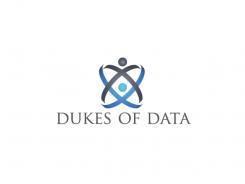
An atom logo? Well, why not - for us it is more an AI related symbol than a data specialised one.
We like the reference to technology and future as well but it won't fit us in our vision.
Thanks a lot, we are excited for more of your work,
cheers
joe from Dukes of Data
 Nederland
 België
 France
 Deutschland
 Österreich
 United Kingdom
