No comments
design a unique, catchy, powerfull and fresh logo and corporate identity that reflects our passion for horses
- Contest holder: Atletisch Paard
- Category: Logo & stationery
- Status: Ended
Start date: 05-08-2017
Ending date: 28-08-2017
It all started with an idea...
A short, interactive guide helped them discover their design style and clearly captured what they needed.
Brandsupply is a platform where creative professionals and businesses collaborate on unique projects and designs.
Clients looking for a new logo or brand identity describe what they need. Designers can then participate in the project via Brandsupply by submitting one or more designs. In the end, the client chooses the design they like best.
Costs vary depending on the type of project — from €169 for a business or project name to €539 for a complete website. The client decides how much they want to pay for the entire project.
Thank you for the logo. It looks nice but can you use the horse at the same
Thank you for the logo. It looks nice but can you use the picture at the same way it is included (3-d)so you can see the muscles of the horse. That will be our job. We like to see the natural colour of the horse (brown) on a dark blue or purple background (the colours you used the very first logo you made for us).
Maybe some of these color combinations ....
Thank you for your ideas but we like your previous colourcombi more. Our favourite till now is the purple with brown/orange with the dark purple background and on the white background. We have included a picture of a horse, maybe you can do something with that? Maybe something totally different? Because we like your ideas.
Hello! Do you like this color combination?
Best regards
Zlatoje
Hello, we really like what you did. The logo is alright this way. We are just looking for the right colour combination for us.It is important that we can use it on our shirts en the purple en blue you made as background is a little bit dark fo us. We want to wear some brighter colours blue or purple. And can you make one with shocking (deep)pink with black or dark blue. We want the shirt to become shocking (deep) pink. Hope you understand what i mean. We are not sure which colour it wil become so maybe you can surprise us with some colours? Not too dark. But really great job you did with the logo
No comments
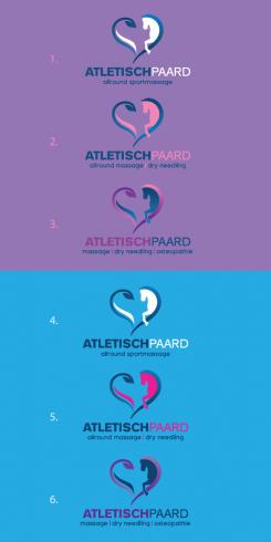
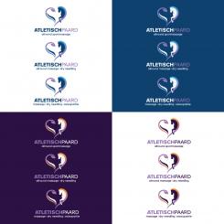
We like your design. We are expanding our work in the future. We want 3 logo's, 1 with subtitle "allround massage", 1 with subtitle "allround massage|dry needling" and 1 with subtitle "massage|dry needling|osteopathie". Maybe you can include this on a suprising manner. And we would like to see the logo in more different colours, maybe deep pink, bright blue or violet/purple but maybe you have some good ideas.
subtitle is allround sportmassage instead of allround massage
 Nederland
 België
 France
 Deutschland
 Österreich
 United Kingdom
