Good evening Robert ;)
As the contest is ending soon, I just wanted to show you a variation of my first proposal in a different color appearance. I worked a bit on the proportions as well, hope you like it ;)
If there should be any suggestions that might improve the design, I'd be happy to hear your opinion and remain at your disposal,
kind regards, Dagmar
Design logo and corporate identity for start-up company in technology
- Contest holder: ebit-services
- Category: Logo & stationery
- Status: Ended
Start date: 16-11-2017
Ending date: 16-12-2017
It all started with an idea...
A short, interactive guide helped them discover their design style and clearly captured what they needed.
Brandsupply is a platform where creative professionals and businesses collaborate on unique projects and designs.
Clients looking for a new logo or brand identity describe what they need. Designers can then participate in the project via Brandsupply by submitting one or more designs. In the end, the client chooses the design they like best.
Costs vary depending on the type of project — from €169 for a business or project name to €539 for a complete website. The client decides how much they want to pay for the entire project.
Hello Robert,
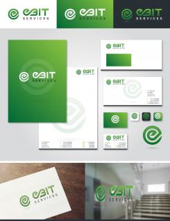
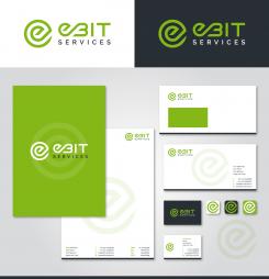
thanx for the positive reaction ;) attached the logo with the requested changes including an according housestyle design. For any adjustements I'll be here for you.
Kind regards, Dagmar
Wow looks good! Now lets see what comes up more, but this one will make a good chance for my final choose at the end of the campain!
Good evening Robert,
this is my first idea. I thought about it quite a while, about implementing visuals for all your four different branches. But concerning the point of quiteness I decided it would look to overloaded, regarding when its already mentioned in the subline.
For me personally, the point of safety in the business of IOT i sthe most important, I thought the visual of a lock would be enough as image.
The connection between the e and b are meant to symbolize the connection between the things.
So far my ideas ;)
Looking forward to your first feedback,
kind regards, Dagmar
I kind of like the EBIT part. The part under it was not what i meant. The full name of the company is EBIT Serivces, so services would be better i think.
The lock in the middle of EBIT is not my thing. It says to much on security, while i want the focus on IT security and IOT.
I kind of like EBIT as it is now, than services under EBIT and on the left a logo of some kind.
Maby you can figure something, about the logo i have no idea, i'm not that kind of creative ;)
Also i would like to see the whole picture, with the corporate identity to. Gives me a better look and feel how the whole picture will look like.
Thanks for your creativity,
Robert
 Nederland
 België
 France
 Deutschland
 Österreich
 United Kingdom


