No comments
design logo and house style for niche consultancy start-up
- Contest holder: Aute
- Category: Logo & stationery
- Status: Ended
- Files: File 1
Start date: 13-11-2017
Ending date: 27-11-2017
It all started with an idea...
A short, interactive guide helped them discover their design style and clearly captured what they needed.
Brandsupply is a platform where creative professionals and businesses collaborate on unique projects and designs.
Clients looking for a new logo or brand identity describe what they need. Designers can then participate in the project via Brandsupply by submitting one or more designs. In the end, the client chooses the design they like best.
Costs vary depending on the type of project — from €169 for a business or project name to €539 for a complete website. The client decides how much they want to pay for the entire project.
No comments
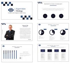
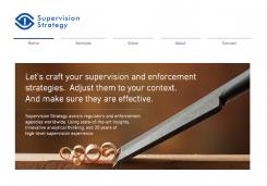
This looks really good ngahoang. My final request: (i) in the contact data, a mobile phone icon rather than the old-fashioned phone icon, and please add a line and icon for visiting address; (ii) would you visualise how a PowerPoint sheet would/should look?
Hi Aute. I fixed follow your request. And file PowerPoint not be supported here. So if you chose me as winner contest I will upload file PP for you
No comments
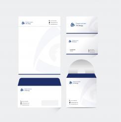
Hi ngahoang, I really love the visual quality of this design. I only have one concern: I like the simple form of the pawn, but symbolically the pawn is not a very strong figure, as it is the weakest piece on the chessboard.. perhaps you could experiment with a different chess piece, while maintaining the simplicity and recognisability of this design? Also, could you visualise what the overall house-style would look like? Thanks! Aute
Hi Aute, thank you for feedback. I submitted revision logo and made example stationary. The design available vector include the font. Hope you like it. With any change please let me know
 Nederland
 België
 France
 Deutschland
 Österreich
 United Kingdom
