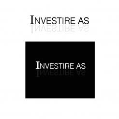
you have a good sense for design, i like it better this way to..
the grey tints make it look more professional.
i made the design with 2 different background shapes, depends on your taste what you will choose.
greeting,
Luke
Design logo for investment company
- Contest holder: erich
- Category: Logo & stationery
- Status: Ended
Start date: 28-06-2012
Ending date: 12-07-2012
It all started with an idea...
A short, interactive guide helped them discover their design style and clearly captured what they needed.
Brandsupply is a platform where creative professionals and businesses collaborate on unique projects and designs.
Clients looking for a new logo or brand identity describe what they need. Designers can then participate in the project via Brandsupply by submitting one or more designs. In the end, the client chooses the design they like best.
Costs vary depending on the type of project — from €169 for a business or project name to €539 for a complete website. The client decides how much they want to pay for the entire project.
it's displayed a bit darker then it is in my file...
this is the color code: http://www.color-hex.com/color/414042
i'm glad to hear the positive reactions,
i've included 4 different color styles.
- 2 font colors
- 2 background colors
i hope this is what you had in mind.
greetings,
Luke
the website makes the color look different, it's more towards grey than this..
Maybe it looks better in greys. Could you try it with a very light grey the main name, a darker grey for the solid reflection and the background in really dark grey. Make the box not square (like the first on you made) with straight edges please.
i have included the following samples:
- 3 different color styles
- 2 different reflection styles
- 2 different background styles
I am looking forward to hear your reaction
greetings,
Luke
The response from one of the shareholders is quite positive.
Could you try to make the blue gray sample even darker. Then instead of a solid white font for the main name, may be tune it to a very light blueish grey color.
i have included 2 shades of grey. you can also go with a dark blue grey or brow grey if u like.
thank you for your quick reply's by the way.
greetings,
Luke
the darkest grey look almost black on the website, it is a little lighter in my design.
Thank you. Dark blue gray could be nice. Could you split the different shades into seperate logos so that I could show my shareholders the "real" thing?
i have included 2 different values of reflections and for both values one gradient and one solid reflection.
(i hope the website will display the designs at a good quality..)
i look forward to your reaction.
greetings,
Luke
I like the both. So far your suggestion are by far the best.
Could you change the black color to dark grey?
sure, will be done in a moment..
My name is Luke,
i have designed a clean and chique logo..
if you like the concept or if you would like to adjust something, please let me know.
i hope to hear from you.
I like your design, however, there is a competing Norwegian company with a similar design http://www.newsec.no/.
Maybe if you make the mirror-effect more visible it will appear more different? Maybe we could use a really dark grey color instead of black?
What do you think.
thank u for your reaction.
i will work something out with some grey instead of black, or maybe a few shades of grey.
i will have a look at the reflections too.
i'm going to post a few different designs as soon as possible.
greetings,
Luke
Can you just start with making the reflection more visible? Maybe that will do the difference.
 Nederland
 België
 France
 Deutschland
 Österreich
 United Kingdom
