No comments
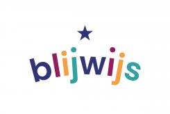
Develop a fresh and cheerful logo for our coaching practice for gifted children
- Contest holder: Blijwijs
- Category: Logo & stationery
- Status: Ended
Start date: 26-04-2022
Ending date: 03-05-2022
It all started with an idea...
A short, interactive guide helped them discover their design style and clearly captured what they needed.
Brandsupply is a platform where creative professionals and businesses collaborate on unique projects and designs.
Clients looking for a new logo or brand identity describe what they need. Designers can then participate in the project via Brandsupply by submitting one or more designs. In the end, the client chooses the design they like best.
Costs vary depending on the type of project — from €169 for a business or project name to €539 for a complete website. The client decides how much they want to pay for the entire project.
No comments
Hello, I slightly changed the logo by moving the star above the W. This generates two graphic elements that can be reused in the complete visual identity: the star surrounded by the 4 dots as a banner for example, and the star with the w could be used as an icon. I can show you these elements more clearly if you ask me.
Sincerely
BasG
Hello, here is my proposal, I hope you like it.
If you wish I can explain the ideas behind the design. First of all, I chose a fresh and happy colour palette, as you asked, to emphasize the childish aspect. Secondly, I chose a simple, lower case typography to emphasise the lightness of the Blijwijs. Finally, the curvature of the text and the offset of the dots on the i's and j's allows the logo to be "elevated", to give it an upward dynamic. This movement brings the eye to the star, which is a nod to gifted children, while making the logo unique.
I remain at your disposal for any modification or remark.
Sincerely,
Bas G
 Nederland
 België
 France
 Deutschland
 Österreich
 United Kingdom
