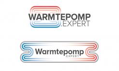
Beste Bart,
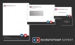
Hierbij een idee van een huisstijl.
Ik hoor graag van je.
Joost
Develop a logo and housestyle for www.warmtepomp.expert
- Contest holder: bartvdh
- Category: Logo & stationery
- Status: Ended
- Files: File 1
Start date: 26-07-2016
Ending date: 09-08-2016
It all started with an idea...
A short, interactive guide helped them discover their design style and clearly captured what they needed.
Brandsupply is a platform where creative professionals and businesses collaborate on unique projects and designs.
Clients looking for a new logo or brand identity describe what they need. Designers can then participate in the project via Brandsupply by submitting one or more designs. In the end, the client chooses the design they like best.
Costs vary depending on the type of project — from €169 for a business or project name to €539 for a complete website. The client decides how much they want to pay for the entire project.
Beste Bart,
Dank voor je feedback en beoordeling. Hierbij een nieuwe uitwerking op het logo. Ik hoor graag weer van je.
Joost
No comments
Hi Joost, many thanks for your submission. From the three designs we like both the top and bottom design for the outset. The advantage of the bottom design is that this depicts the webaddress in a better way (all together on one line). We'd like to see the core of the picture we attached better back in the design. The center area of the picture with the nrs. 1-4 around it. Would that be possible? Keen to hear from you and/or see alterations. Kind regards, Bart
 Nederland
 België
 France
 Deutschland
 Österreich
 United Kingdom
