No comments
Do you want to put me on the map as Human Resources development consultant?
- Contest holder: Nathaly
- Category: Logo & stationery
- Status: Ended
Start date: 16-02-2018
Ending date: 23-02-2018
It all started with an idea...
A short, interactive guide helped them discover their design style and clearly captured what they needed.
Brandsupply is a platform where creative professionals and businesses collaborate on unique projects and designs.
Clients looking for a new logo or brand identity describe what they need. Designers can then participate in the project via Brandsupply by submitting one or more designs. In the end, the client chooses the design they like best.
Costs vary depending on the type of project — from €169 for a business or project name to €539 for a complete website. The client decides how much they want to pay for the entire project.
No comments
Hi Nathaly,
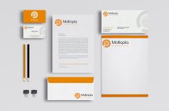
Here's a quick mock up for you stationery design, using one of the logos i sent you earlier, hope you like it :)
Sol
No comments
Hi Nathaly!,
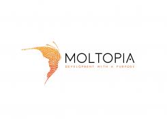
thanks for your feedback, here's what your font choices look on the two variants i sent you earlier, as for the fingerprint issue i increased the thickness of it for this version so Print shouldn't be a problem (but if you want to i can always send you two versions if i win with thicker fingerprint effect for Print and a finer effect for Digital use), after you choose what version you like better i will start working on the stationery design.
Best Regards,
Sol.
No comments
Hi Nathaly,
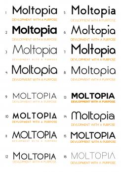
thanks for the rating and feedback, here's a little selection of some Sans Serif fonts, that i think will look good with the the logo, i can also add some Serif font but it will make the logo feel less "modern" and more "institutional"
My favourites are nr, 1 and 4. Could you also make the fingerprint a bit less fine (aslo not too big). My fear this will not come of well in all printers. Thank you, Nathaly
No comments
Hi Nathaly,
Sorry for the misunderstanding is this better?
Yes Sol, looking way better.
Cocerning the font now. Could you show some more styles in that?
No comments
Hi Nathaly
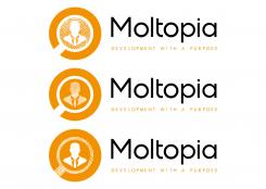
here's a modified version of the 1st design like you asked, i made 3 variants where i tried applying the fingerprint effect on the different elements of the magnifying glass,
Sol.
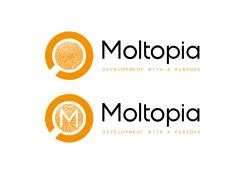
Dear Sol, Thank you and I was not clear I think. The idea I had was to fill the full innercircle with a fingerprint, without the person in it. This way its clean and simple. Another suggestion I have is to put the letter M in the circle. Would it possible to work on those 2 suggestions. And again apologies for my unclarity. Best, Nathaly
No comments
Thanks for the honest feedback Nathaly, this type of constructive feedback is good for improving my creative process,
anyway here's to use a more minimalistic style for those versions,
Best regards,
sol
No comments
Hi Nathaly,
thanks for your feedback, here's a new version for the design that hope suits your vision better,
If you have any request please feel free to ask
Best Regards,
Sol
Thank you Sol, I liked the previous version better to be honest. This is too much. Apologies.
No comments
Het idee vind ik leuk, maar of een of andere manier spreekt het niet. Zou je de bderijfsnaam in het zwart kunnen doen om te kijken of dat beter uitpakt? Het logo kan ik waarderen, alleen hoeft een 'mens ' niet in mijn log te komen.
Zou je een fingerafdruk in het midden kunnen plaatsen, want spreekt me erg aan!
Zou je een fingerafdruk in het midden kunnen plaatsen, want spreekt me erg aan!
Dear Sol, thanks for taking the efforts and showing different styles. Coming back to this original version, I would like to try out something as I like this one still too. It is clean and simple. Could you make the inside ( the magnifying glass) in fingerprint? The font of Moltopia is good but could you change it in normal black. Thanks, Nathaly
 Nederland
 België
 France
 Deutschland
 Österreich
 United Kingdom
