No comments
Haendel logo and identity
- Contest holder: lperez
- Category: Logo & stationery
- Status: Ended
Start date: 19-11-2021
Ending date: 06-01-2022
It all started with an idea...
A short, interactive guide helped them discover their design style and clearly captured what they needed.
Brandsupply is a platform where creative professionals and businesses collaborate on unique projects and designs.
Clients looking for a new logo or brand identity describe what they need. Designers can then participate in the project via Brandsupply by submitting one or more designs. In the end, the client chooses the design they like best.
Costs vary depending on the type of project — from €169 for a business or project name to €539 for a complete website. The client decides how much they want to pay for the entire project.
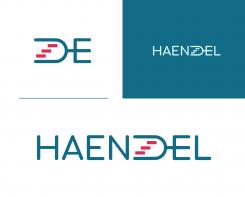
This is another logo proposal for you. In this logo design, you will find a tuning fork which is horizontally placed. A part of the tuning fork forms the letter D and the other end, forms a part of letter E. In the tuning fork, three rectangles are found. The three rectangles represent musical tones. A tuning fork resonates at a specific constant pitch when set vibrating by striking it against a surface or with an object, and it emits a pure musical tone once the high overtones fade out. These musical tones can be seen as a set of stairs that lead to the top. This signifies growth. Kindly let me know what you think about my logo proposal
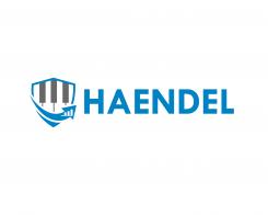
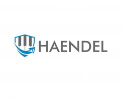
Hi, this is my logo proposal for you. I made an intensive research on Haendel and discovered that his classical musical instrument was a harpsichord. In other to make reference to his art, I decided to include the keys of a harpsichord, which are formed by the grey lines you see in the logo, just like you have in a grand piano. I also included a shield element which depicts trust and security in the logo. Lastly, the upward arrow depicts financial growth and the bar chart in the logo shows the statistics of the growth. Let me know what you think about my logo concept.
 Nederland
 België
 France
 Deutschland
 Österreich
 United Kingdom
