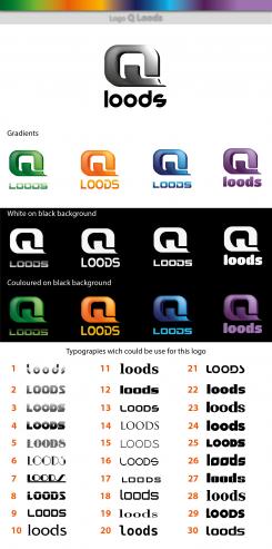
hi.
here are the changes you requested in your last message.
do not hesitate to ask me if you have any questions, even if you don't choose my proposal
Logo and brand style
- Contest holder: Castillo
- Category: Logo & stationery
- Status: Ended
- Files: File 1, File 2, File 3
Start date: 24-03-2018
Ending date: 04-04-2018
It all started with an idea...
A short, interactive guide helped them discover their design style and clearly captured what they needed.
Brandsupply is a platform where creative professionals and businesses collaborate on unique projects and designs.
Clients looking for a new logo or brand identity describe what they need. Designers can then participate in the project via Brandsupply by submitting one or more designs. In the end, the client chooses the design they like best.
Costs vary depending on the type of project — from €169 for a business or project name to €539 for a complete website. The client decides how much they want to pay for the entire project.
hi.
here is a second proposal.
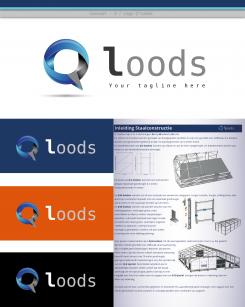
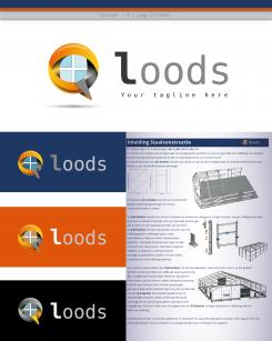
always based on the letters "Q" and "L", getting closer to the design you wanted.
main form of design:
the combination of initials form a discussion bubble; symbolizing the attention, the listening and the dialogue that you grant to your client.
the different cuts of this shape, make a geometric figure called drawing of penrose or impossible drawing. This to symbolize creativity and implementation by all available means at your disposal to satisfy the demands of your customers.
Inside, a stylized "window" reminding your industry. The cross forming the drawing of the window can also recall the parts of the structures that you assemble.
Colors of the design:
Orange, anthracite gray, white / with gradients of these same colors
these colors are used to represent the industrial activity and communication.
they have the advantage of being based on clear or dark backgrounds without creating unsightly white fringe on the contours of the design.
typography :
I opted for a thick semi-fat type for the letter "L" and normal for other letters to create a contrast to draw attention to the name of your company.
The shape of the round letters in accordance with the shape of the logo. The letter "L" of the typography is close to the "L" of the logo.
typography both elegant and used in the technical activity sectors.
to finish, as shown on the presentation, it is possible to add a tagline or slogan and a shadow under the logo to give it a little more character and balance the whole.
of course, this logo can be used alone or combined with the name and vice versa.
regards,
JpM.
hi.
here is my proposal.
I opted for a thick grease icon to emphasize the aspect of strength on the one hand, but also to symbolize by the shape of the letter "q" and "l" a building (stylized).
the letter 'l' represents the access and the entrance of this building.
regarding the typography of the name of your sign, a wide choice can be used.
here is an example of typography, knowing that thick typos reinforce the aspect of strength, but are less readable if you reduce the size of your logo.
best regards.
K1.
 Nederland
 België
 France
 Deutschland
 Österreich
 United Kingdom
