No comments
Logo and Branding for KALAPA Herbal Elixirbar
- Contest holder: KALAPA
- Category: Logo & stationery
- Status: Ended
- Files: File 1, File 2, File 3
Start date: 26-02-2020
Ending date: 18-03-2020
It all started with an idea...
A short, interactive guide helped them discover their design style and clearly captured what they needed.
Brandsupply is a platform where creative professionals and businesses collaborate on unique projects and designs.
Clients looking for a new logo or brand identity describe what they need. Designers can then participate in the project via Brandsupply by submitting one or more designs. In the end, the client chooses the design they like best.
Costs vary depending on the type of project — from €169 for a business or project name to €539 for a complete website. The client decides how much they want to pay for the entire project.
No comments
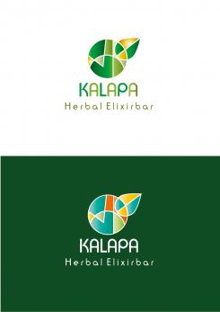
Hierbij een nieuw ontwerp. (Dacht door onderstaande feedback dat Engels de 'voertaal' is, maar volgens mij kan het in het Nederlands:)) Ik heb de K zoals in het Sanskriet geschreven gebruikt om een cirkel mee te vormen. Vriendelijke groet, Remarij.
Kan uiteraard ook in andere kleuren/kleurstellingen.
No comments
Thanks for your work! I like the logo and toughts behind it and typo is cool too but unfortunately its not what im looking for.
It has a bit of a too "clinical" appearance. Missing a magical touch. Also, the word Herbal Elixirbar is difficult to read. Imagine walking around at a festival and you will see this sign. Its hard to read that you can get a drink here :)
sorry this website is not working proparly
Haha! Read it three times now! I'll design a new one:)
<3
No comments
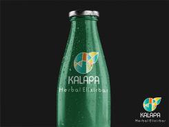
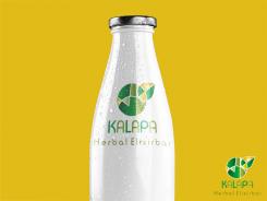
Also, Kalapa is nog a specific drink. We will be selling drinks but it is a Bar so it will be a bar sign
Ah!!:) Thank you for your feedback! I will place the logo on something different, so you can get an impression.
Yeah, now I uderstand the bar in elixirbar:)
No comments
Thank you for your work! Can you explain a bit more about this logo?
To me the logo (figurative mark) as such stands for nature (The colours. And the leaf that sprouts from the circle (transformation)) as well as for health/strength and it has 'a tribal vibe'.
Thanks for your work! I like the logo and toughts behind it and typo is cool too but unfortunately its not what im looking for.
It has a bit of a too "clinical" appearance. Missing a magical touch. Also, the word Herbal Elixirbar is difficult to read. Imagine walking around at a festival and you will see this sign. Its hard to read that you can get a drink here :)
Thanks again for the feedback. And I understand the point(s) you make. I'll make another one.
 Nederland
 België
 France
 Deutschland
 Österreich
 United Kingdom
