No comments
Logo and corporate identity for a new health platform
- Contest holder: Sisano
- Category: Logo & stationery
- Status: Ended
Start date: 16-05-2019
Ending date: 30-05-2019
It all started with an idea...
A short, interactive guide helped them discover their design style and clearly captured what they needed.
Brandsupply is a platform where creative professionals and businesses collaborate on unique projects and designs.
Clients looking for a new logo or brand identity describe what they need. Designers can then participate in the project via Brandsupply by submitting one or more designs. In the end, the client chooses the design they like best.
Costs vary depending on the type of project — from €169 for a business or project name to €539 for a complete website. The client decides how much they want to pay for the entire project.
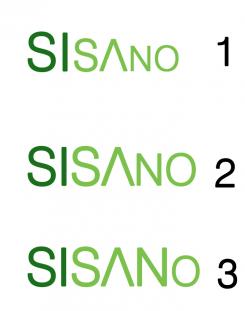
et pour le texte le 1er c'est avec un dégradé d'echelle,le 2ème sisa est plus grad que no et pour le 3ème selement le o est plus petit
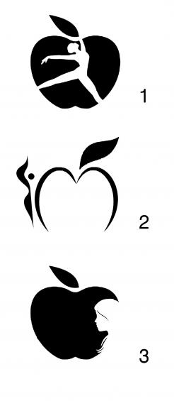
ici j'ai proposé des icônes,pour le 3ème icone je l'ai ajouté à la dernière minute j'ai trouvé ça sympathique puisqu’il ressemble à celui de la marque APPLE
merci pour votre feedback,j'ai proposé 4 logo merci de choisir un pour le développer plus
Bonsoir,
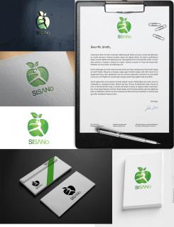
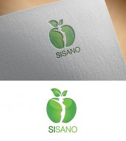
voici ma proposition,la pomme qui symbolise la bonne santé et tout ce qui est healthy,la femme qui se trouve dedansqui est en bonne santé,merci de partager vos remarqes avec nous
Hi Marten, Thanks a lot for your design. You are one of the 3 that we really like. Is it maybe possible to make the logo smaller or part of the text (e.g. the letter o)? We would like a font with an a that's the v turn upside down. And could you do a proposal for corporate identity and icons as well? We would like to make the final decision on Friday. If you have any questions, please reach out. Thanks a lot. BR Inez
 Nederland
 België
 France
 Deutschland
 Österreich
 United Kingdom
