Hey there,
This is a different approach to the same idea I sent you yesterday. This one has more depth and brighter colors. I also used bold lines which stands for stability and profesionalism.
Let me know if you like the direction in which I am going.
Hristo
Logo and corporate identity for a new, small-scale healthcare facility
- Contest holder: janluesink@mac.com
- Category: Logo & stationery
- Status: Ended
Start date: 23-12-2016
Ending date: 20-01-2017
It all started with an idea...
A short, interactive guide helped them discover their design style and clearly captured what they needed.
Brandsupply is a platform where creative professionals and businesses collaborate on unique projects and designs.
Clients looking for a new logo or brand identity describe what they need. Designers can then participate in the project via Brandsupply by submitting one or more designs. In the end, the client chooses the design they like best.
Costs vary depending on the type of project — from €169 for a business or project name to €539 for a complete website. The client decides how much they want to pay for the entire project.
Hey,
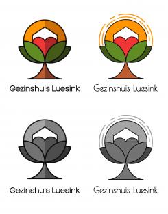
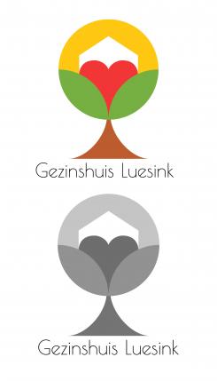
Here is another idea for the logo. It is a totally different approach but I hope you like it. I kept the heart and the house, but i used only 1 heart, so it doesn't get too crowded with hearts :)
The sun and the heart symbolize the warmth and the love. The tree is the growth of your company as you mentioned that now it is becomming bigger and that is why you change the name. And the house symbolises the home you are offering to the people in need.
Green again is hope and growth. Red is love. Yellow is warmth and brown is reliability and security,because you want to be percieved as a secure company by your clients.
The style is very minimalistic and simple, so it is memorable and easy to use in big and small size. It doesn't have too many details, so it is easy for the eye and the colors work well together.
Please tell me what do you think.
Thanks,
Hristo
Hey there,
My name is Hristo.
I hope you enjoy my design.
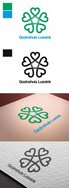
I used the heart like a symbol of love and hope. I put 5 interconnected hearts so there is the sence of family and community, that nobody is alone.
Also in the middle of the 5 hearts there is a shape of a house, so that again we remind people that Gezinshuis Luesink is about feeling at home.
I used green and blue, because they mean hope and dreams. The colours can be changed if you have something in mind.
Please let me know what do you think.
All the best,
Hristo
Hi Hristo,
Thanx for your design. I like it. Although there is a lot of hearts. Maybe a little bit to much. Maybe you can make the hearts les obvious?
Hey Jan,
I will do my best. Do you like the direction of the idea?
 Nederland
 België
 France
 Deutschland
 Österreich
 United Kingdom


