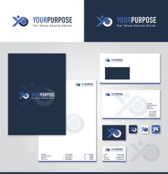
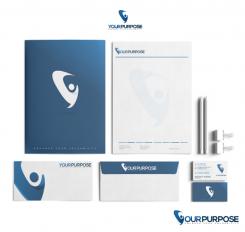
Logo and corporate identity for a purpose oriented startup that focuses on organizational development
Contest details:
Bronze
- Contest holder: YourPurpose
- Category: Logo & stationery
- Total budget: € 319.00
- Start date : 30-09-2017 11:34
- Ending date : 07-10-2017 00:00
- Status : Ended
- Required formats: jpg,ai,pdf
- Relevant files: None
- Available languages:
- Number of designs: 87
-
Response rate:
low high
Needs:
The startup name is YourPurpose. May also be written as Your Purpose (i.e. with a space).
YourPurpose is a company active in professional business services. It is a purpose oriented business, which means that its activities contribute to the interests of all stakeholders of an organization. These stakeholders are not only shareholders, but also employees, customers and suppliers and our society / environment. The business activities must have a positive impact for PEOPLE and PLANET, which ultimately results in a sustainable positive impact on the PROFIT for a company.
The look and feel of the logo and corporate identity must have a business appearance, be fierce, powerful and distinctive. Not a color palette, but a logo and house style using only one or a few colours
Tagline
We also want to include a catchy tagline in the logo. That tagline should refer to the values development that YourPurpose represents. Sustainable development of the values for all stakeholders of a company. The tagline must be in English and we think the word value / values should be in it. We also thought of a tagline containing the word valuability. That's a non-existent word in English, but it implies perfectly what YourPurpose stands for: enable companies to develop their values.
Company description:
Target group:
Colors, favourites and other requirements
artamad
-
-
No comments
-
This contest is finished. Its not possible to reply anymore.
-
-
-
No comments
-
This contest is finished. Its not possible to reply anymore.
-
-
-
No comments
-
This contest is finished. Its not possible to reply anymore.
-
-
-
No comments
-
This contest is finished. Its not possible to reply anymore.
-
-
-
No comments
-
This contest is finished. Its not possible to reply anymore.
-
-
-
YourPurpose says :
I like the stationery design. One remark I received from people I know: there could be confusion in reading the letter "Y". People could read "our purpose" instead of "Your Purpose" if they don't see that the figure represents the letter "Y". What do you think?
-
artamad says
I could adjust the y so it would look more like a Y
-
This contest is finished. Its not possible to reply anymore.
-
-
-
No comments
-
This contest is finished. Its not possible to reply anymore.
-
-
-
No comments
-
This contest is finished. Its not possible to reply anymore.
-
-
-
No comments
-
This contest is finished. Its not possible to reply anymore.
-
-
-
YourPurpose says :
Very nice design. I like the font you used and the use as the letter "Y" . Can you show how this logo would look on stationery?
-
This contest is finished. Its not possible to reply anymore.
-
-
-
YourPurpose says :
I saw the logo you made for Azenda and like that one very much. Could you develop a logo for us, more in line with the Azenda design?
-
artamad says
Hmm, any specific representatiom you want? So I can develop the same quality for you.
-
This contest is finished. Its not possible to reply anymore.
-