No comments
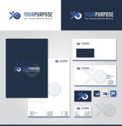
Logo and corporate identity for a purpose oriented startup that focuses on organizational development
- Contest holder: YourPurpose
- Category: Logo & stationery
- Status: Ended
- Files: File 1, File 2, File 3
Start date: 30-09-2017
Ending date: 07-10-2017
It all started with an idea...
A short, interactive guide helped them discover their design style and clearly captured what they needed.
Brandsupply is a platform where creative professionals and businesses collaborate on unique projects and designs.
Clients looking for a new logo or brand identity describe what they need. Designers can then participate in the project via Brandsupply by submitting one or more designs. In the end, the client chooses the design they like best.
Costs vary depending on the type of project — from €169 for a business or project name to €539 for a complete website. The client decides how much they want to pay for the entire project.
No comments
Interesting design, this one. One remark: I am afraid that people will read "our purpose" instead of "Your Purpose". Is it possible to adjust the "Y", so that it becomes clearer.
No comments
I like this one best, especially what you did with the "Y".
No comments
Thanks for your contribution. I saw you also designed a logo for Azend and I like that one more than this design for YourPurpose. Could you design something more in line with that one? And do you have ideas for a catchy tagline?
 Nederland
 België
 France
 Deutschland
 Österreich
 United Kingdom
