No comments
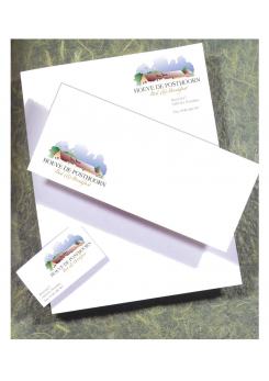
Logo and corporate identity for Bed and Breakfast
- Contest holder: cocange
- Category: Logo & stationery
- Status: Ended
- Files: File 1, File 2, File 3
Start date: 20-09-2013
Ending date: 04-10-2013
It all started with an idea...
A short, interactive guide helped them discover their design style and clearly captured what they needed.
Brandsupply is a platform where creative professionals and businesses collaborate on unique projects and designs.
Clients looking for a new logo or brand identity describe what they need. Designers can then participate in the project via Brandsupply by submitting one or more designs. In the end, the client chooses the design they like best.
Costs vary depending on the type of project — from €169 for a business or project name to €539 for a complete website. The client decides how much they want to pay for the entire project.
No comments
This is the same as the first one. we love to see our green weadows. Unfortunately, we don't sell air.
This is the same as the first one. we love to see our green weadows. Unfortunately, we don't sell air.
Hallo,
attached two modified proposals. Content: sunrise- and sunset Sujet.
Kind regards
Sorry but this is far from enough for us. the roof and the (dark) clouds are still too overwhelming. It's not inviting enough at the moment; still the basic idea is very good. can you adapt? Thx Saskia
Hallo,
attached my modified proposal. The clouds are much brighter... but of course they are absolutly necessary for the compactness of the whole logo.
Futheron three kind of typos... sorry, but the firstone from yesterday was the best of all. Please pay attention, that two extreme different typos in one logo give rise to a great attention for each one!
Kind regards
Thx for the adaptation. We have shown your design to others also and frequent reply was that the roof was too dominant versus the air and house itself.
Sorry but the design still lacks warmth and maybe a sun can help?? On type we like the version which is at the bottom of the 3 but without the line&stars; inbetween the words.
Does this help you further?
Hallo,
thank you for your reply.
Sorry, but you call the whole drawing in question. The roof is as long as shown and the color is dark.
As a painter I feel differnt about it. It is a bright very positive kind of aquarell with the color of the clouds too.
Now I'm very confused!
Kind regards
Hallo,
attached my second proposal
kind regards
No comments
Hallo Lamby,
hartelijk dank voor je inzending. We vinden het logo heel passend. Het heeft echt betrekking op onze B&B. Het is uniek, stylish en werkbaar.
Graag zouden we nog een paar aanpassingen wensen:
* het logo mist nog wat warmte door overheersende luchtschaduw
* de letters Bed & Breakfast vallen een beetje weg. Graag kleur en lettertype aanpassen
We zijn erg benieuwd naar de aanpassingen!
Chapeau tot wat er nu staat.
Hallo,
habe etwas Probleme mit dem Holländischen. Können Sie mir die zu Modifizierenden Punkte in Deutsch oder Englisch kurz mitteilen. Bitte bedenken Sie auch, dass es gerade die Typografie ist, die das gesamte Bild des Logos prägt... sie ist mehr als passend!
Habe noch einen weiteren Entwurf in Arbeit!
Viele Grüße!
Sorry, missed the language. We like your first proposal very much!! We would like some adaptations: The logo is lacking warmth because of the dark clouds above the farm; can you add warmth? Next to this the typo Bed & Breakfast are almost too subtle versus the text Hoeve deposthoorn; please can you show us some other typos of Bed& Breakfast? Thx!! Viele Grusse
 Nederland
 België
 France
 Deutschland
 Österreich
 United Kingdom
