No comments
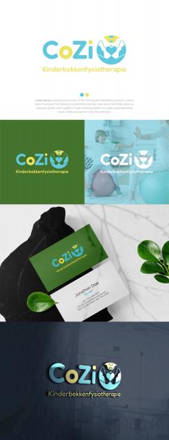
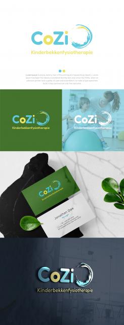
Logo and corporate identity for pediatric pelvic physiotherapy
- Contest holder: CoZi
- Category: Logo & stationery
- Status: Ended
Start date: 14-03-2022
Ending date: 26-03-2022
It all started with an idea...
A short, interactive guide helped them discover their design style and clearly captured what they needed.
Brandsupply is a platform where creative professionals and businesses collaborate on unique projects and designs.
Clients looking for a new logo or brand identity describe what they need. Designers can then participate in the project via Brandsupply by submitting one or more designs. In the end, the client chooses the design they like best.
Costs vary depending on the type of project — from €169 for a business or project name to €539 for a complete website. The client decides how much they want to pay for the entire project.
No comments
thanks, better but a bit too busy
No comments
Hi Hello,
Here is my proposal for your logo.
Hope you like it :)
Greetings
Mehru
Hi Mehru, very nice logo with the circle. Nice colours. I wonder how you could at a little more the childside or the pelvis. If you now look at the sign you can't immediatly see that it's about the pelvic guirdle.
Thank you for taking the time to give me a valuable feedback ! :)
Thank you for taking the time to give me a valuable feedback ! :)
 Nederland
 België
 France
 Deutschland
 Österreich
 United Kingdom
