Two color variation, spring and autumn, with colored background.
Logo and Design for Catering Company
- Contest holder: mvirmond
- Category: Logo & stationery
- Status: Ended
Start date: 02-10-2012
Ending date: 12-10-2012
It all started with an idea...
A short, interactive guide helped them discover their design style and clearly captured what they needed.
Brandsupply is a platform where creative professionals and businesses collaborate on unique projects and designs.
Clients looking for a new logo or brand identity describe what they need. Designers can then participate in the project via Brandsupply by submitting one or more designs. In the end, the client chooses the design they like best.
Costs vary depending on the type of project — from €169 for a business or project name to €539 for a complete website. The client decides how much they want to pay for the entire project.
Two color variation, spring and autumn, with accentuated parsley.
Two color variation, spring and autumn, with white parsley.
Same design but with more approriate symbol - parsley.
Goal was freshness and sophistication. I hope I achived it.
Just three? Really? I give up!
This one is the same as previous, just with replaced foreground and background colors.
Hope you like it!
nice design, but overall I don't think it will ultimately make it...
This is my final design.
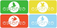
It has four color variations. The colors symbolize four seasons spring-green as grass, summer - yellow as sun, autumn - orange/red as dry leafage and winter - bright blue as cold winter sky.
The font is simple and easy readable but modern.
About the name itself, when you put tougether "essen" and "sense", comon letters are "sen" so they are emphisized by colored circle. Then you have symetric "es" and "se", so I put them to be symetric.
And as a final touch I added bird that could convey lightness, freedom and a reference to nature, as you sad. Every season has each bird.
Spring - hummingbird, summer - seagull, autumn - swallow and winter - sparrow.
I hope you like it!
I forgot to say that the the bird have spread wings in raltion with the fact that the catering company is in movement. It seems as the birds fly and bring the food.
writing mistake, not ralition - relation. and your catering business is in a lot of motion, because of the ordering and bringing... I hope I'm made it clearer now.
same here - nice, but not my favorite yet.
Because the target costumers are business people with above average income the design is search for core elegance.
Simple design, but remmberable.
The logo clearly indicates the type of business, and it is subtly connected with the font, which is stylish and elegnat.
I have done some color variations, so I am ready to upload them if you are satisfied with the design.
not bad, but i guess we have two concerns: not sure what it is about the silver plate logo, but we don't like it so much (in general). maybe it's just too oldfashioned.
Plus the font is very thin. used as a thumbnail or other small format, it becomes extremely hard to read
I must agree with you. Font is thin, but it is the most effective there is. I could bold it but I'm not sure how it will look like... Ok, I'll take care of the font, but the logo itself I have too go from scratch? I thought about combinating plate and wheels, but it will lose its sophistication.
Are you more for a symbol of your kind of business like plate, bowl..., or for an abstract logo? I went for the simplisity, because it looks sophisticated. But it if that's not so important to you please note! Thank you!
 Nederland
 België
 France
 Deutschland
 Österreich
 United Kingdom
