Logo and Design for Catering Company

Start date: 02-10-2012

Ending date: 12-10-2012

Total budget: € 449.00
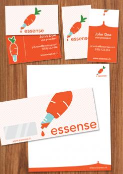
Latest design
Book cover
somika87

It all started with an idea...

A short, interactive guide helped them discover their design style and clearly captured what they needed.

Needs


For our catering business "essense" we still need an appealing Logo and Design.
Specifically, final submissions should include:
- Logo
- Color scheme (e.g. for our website)
- Brief guidelines für using logo, colors and fonts
- Template for business cards
- Template for brochures

You may initially submit just the logo. We will provide feedback on a regular basis. If we like the logo (4-5 stars) you can submit the remaining elements later (however, please submit them BEFORE the competition finishes).

Company description


We are offering catering for companies/offices in central Switzerland (esp. Kanton Zug).
In particular, we offer lunch options (initially salads, sandwiches, juices, desserts), at a later stage potentially expanding into other product groups and services/delivery times. All orders are placed online.

We aim to position ourselves with high quality, fresh, tasty, healthy/light products, at a very affordable price.
Additional brand attributes include: regional (central Switzerland), innovative, reliable, clean/hygienic.
Our brand name includes "essen" (German for food), "essence" as well as "sense"/"senses".

Target group


Our target customers are business people/office workers in central Switzerland, i.e. above average income, appreciative of quality, international mix.
We aim to target in particular those customers who are looking for high quality, healthy food.

Colors, favourites and other requirements


There are no restrictions for the logo design, we are open to all suggestions.
If the logo does not contain the brand name "essense" (capital letter spelling still tbd) in writing, your suggestion should also include a graphic design for the actual brand name.

The color scheme should include a suggestion which colors (RGB codes or similar) to use for background, highlighting, buttons, writing etc.

Guidelines should outline in a few bullet points how to use logo and color scheme (e.g. which background colors can the logo be placed on), as well as a suggestion for one (or more) font types (ideally standard fonts), and potentially other suggestions (at your discretion).

The brochure template will be used primarily for a summary of our offering and the company, presumably in a simple A4-portait-format - so this is not a flyer or anything fancy. Just simple application of the above logo and design (same for business card)

Designer: studioZ studioZ
logo_huisstijl-studioz-bKuz22pU

studioZstudioZ

another try

mvirmondmvirmond

still not quite what I'm looking for

This contest is finished. Its not possible to reply anymore.
logo_huisstijl-studioz-rzkybg7k

studioZstudioZ

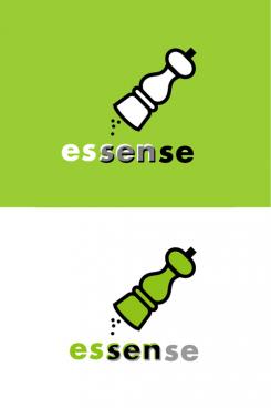
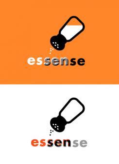
Thanks for your clear comments, it made me come up with a new idea.

mvirmondmvirmond

not a bad idea. unfortunately, from a nutritional point of view, many experts nowadays recommend people to eat less salt. so i'm not sure we'll put a somewhat "unhealthy" product front and center for our brand

studioZstudioZ

It wasn't my intention to say Eat lots of salt, but that salt is essential (essense) for taste.

This contest is finished. Its not possible to reply anymore.
logo_huisstijl-studioz-QY4PMhUm

studioZstudioZ

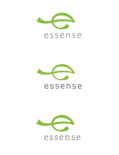
And here is a new idea, with the "e" as a leaf. Small variations in shape and type.

mvirmondmvirmond

looks fun

mvirmondmvirmond

i still like it, but realistically it won't make the final selection...

This contest is finished. Its not possible to reply anymore.
logo_huisstijl-studioz-PvkgYp6m

studioZstudioZ

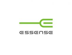
Thanks for your reaction. Here's a new one with matching type.

mvirmondmvirmond

better - but i'm afraid now the font type feels a bit to cool and "techie" to me. reminds me a bit of starship enterprise or something. although i agree it goes with the "E". maybe if you changed the style the of the fork tips, you could also vary the font?

This contest is finished. Its not possible to reply anymore.
logo_huisstijl-studioz-AeEpr7Cq

studioZstudioZ

Hello,
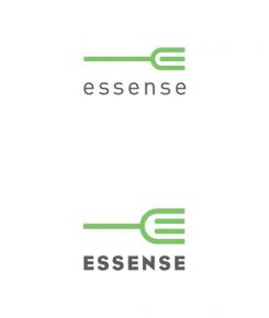
Here are my first ideas for your logo, the E from Essense made into a fork. I would appreciate your reaction.
best regards,
Connie | studioZ

mvirmondmvirmond

not too bad - it's nice and simple, with a clear product reference. maybe a bit too "geometric", if you know what I mean. nice touch combining the e with the tip of the fork - can you make a variation where the font the "essense" has an e that actually resembles the fork shape?

This contest is finished. Its not possible to reply anymore.