No comments
Logo and house style for the most innovative dental practice
- Contest holder: autoklaven-shop
- Category: Logo & stationery
- Status: Ended
Start date: 28-12-2020
Ending date: 08-02-2021
It all started with an idea...
A short, interactive guide helped them discover their design style and clearly captured what they needed.
Brandsupply is a platform where creative professionals and businesses collaborate on unique projects and designs.
Clients looking for a new logo or brand identity describe what they need. Designers can then participate in the project via Brandsupply by submitting one or more designs. In the end, the client chooses the design they like best.
Costs vary depending on the type of project — from €169 for a business or project name to €539 for a complete website. The client decides how much they want to pay for the entire project.
just like in the brief. express maximum protection, calm, collaboration and innovation. they just can't be seen. where will they be !?
No comments
Hi Mihawk, we like this one and the one before this (the blue one). We like the shape, font and the gradients within the shape. We are not sure about the color though. One of the owners likes this orange and doesn't like the blue, another owner doesn't like the blue and likes the orange. Do you think there is a way to find a middle ground between these colors?
just like in the brief. express maximum protection, calm, collaboration and innovation. they just can't be seen. where will they be !?
Hi Mihawk, I hope you will still have time to experiment with colors :)
No comments
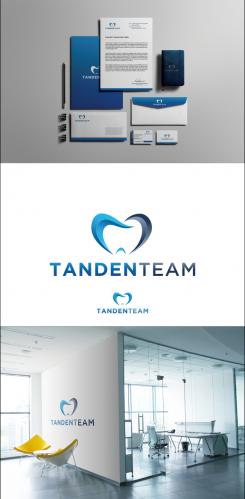
I have improved the logo.
how about this one please feedback?
Thank you.
just like in the brief. express maximum protection, calm, collaboration and innovation. they just can't be seen. where will they be !?
just like in the brief. express maximum protection, calm, collaboration and innovation. they just can't be seen. where will they be !?
just like in the brief. express maximum protection, calm, collaboration and innovation. they just can't be seen. where will they be !?
No comments
Hi Mihawk, thank you for your design. I think this might be our favorite logo thusfar, thank you! But we also aren't quite there yet. We like that the logo expresses a feeling of calmness and softness, and shows collaboration. We would like it to be a bit more dynamic. Besides this, we have decided we don't like having the circles as faces on top of teeth. I hope you have the opportunity to make another design.
 Nederland
 België
 France
 Deutschland
 Österreich
 United Kingdom
