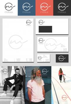
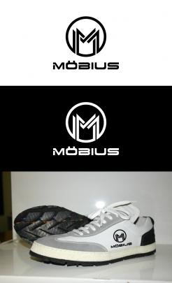
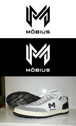
Attached a first idea for an according housestyle,
kind regards, Dagmar
Logo and visual identity for a sneaker brand
- Contest holder: abarboteau
- Category: Logo & stationery
- Status: Ended
- Files: File 1, File 2
Start date: 19-07-2016
Ending date: 02-08-2016
It all started with an idea...
A short, interactive guide helped them discover their design style and clearly captured what they needed.
Brandsupply is a platform where creative professionals and businesses collaborate on unique projects and designs.
Clients looking for a new logo or brand identity describe what they need. Designers can then participate in the project via Brandsupply by submitting one or more designs. In the end, the client chooses the design they like best.
Costs vary depending on the type of project — from €169 for a business or project name to €539 for a complete website. The client decides how much they want to pay for the entire project.
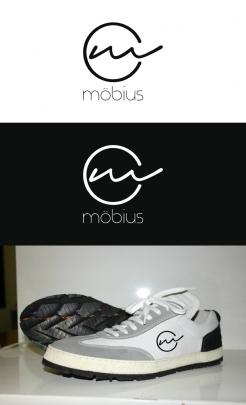
New idea using a handwriting font for the image sign, kind regards
very light and modern
Thank you ;)
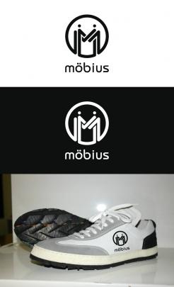
Thank you for your feedback. Attached a revision with rounded corners, maybe this fits your expectations better,
kind regards, Dagmar Lange
Well I think it looks very for men. I am looking for something that can fit men and women
No comments
Logo agressif avec les pointes, l'ensemble fait très masculin
No comments
Le logo est lui même est très complexe
Le lettrage est trop simple
 Nederland
 België
 France
 Deutschland
 Österreich
 United Kingdom
